KalendarAgenda#
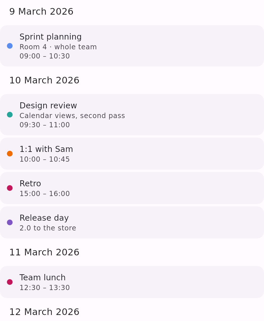
A vertically scrolling list of events grouped by date — the view to reach for when the events matter more than the grid they fall on. Dates with no events are skipped entirely, so the list is exactly as long as the events are dense.
There is no navigation chrome: the scroll is the only navigation.
Minimal example#
import androidx.compose.ui.graphics.Color
import com.himanshoe.kalendar.foundation.event.BasicKalendarEvent
import com.himanshoe.kalendar.KalendarAgenda
import kotlinx.datetime.LocalDate
import kotlinx.datetime.LocalDateTime

val events = listOf(
    BasicKalendarEvent(
        date = LocalDate(2026, 3, 10),
        eventName = "Design review",
        eventDescription = "Calendar views, second pass",
        startTime = LocalDateTime(2026, 3, 10, 9, 30),
        endTime = LocalDateTime(2026, 3, 10, 11, 0),
        eventColor = Color(0xFF26A69A),
    ),
    BasicKalendarEvent(
        date = LocalDate(2026, 3, 10),
        eventName = "Release day",
        eventColor = Color(0xFF7E57C2),
    ),
)

KalendarAgenda(
    events = events,
    onEventClick = { event -> openDetails(event) },
)Parameters#
| Parameter | Type | Default | Description |
|---|---|---|---|
events | List<E> | — | The events to list. |
modifier | Modifier | Modifier | Applied to the outermost container. |
onEventClick | (E) -> Unit | {} | Called when an event row is tapped. |
config | KalendarViewConfig | KalendarViewConfig() | Shared settings — only two of them apply here, see below. |
state | LazyListState | rememberLazyListState() | Scroll state for the underlying list. Own it to read or drive the scroll position. |
dateHeader | @Composable (LocalDate) -> Unit | KalendarAgendaDefaults.DateHeader | Slot for one date's header. |
emptyState | @Composable () -> Unit | KalendarAgendaDefaults.EmptyState | Shown centred in place of the list when events is empty. |
eventContent | @Composable (E) -> Unit | KalendarAgendaDefaults.EventRow | Slot for one event row. The list keeps onEventClick around it. Last, so trailing-lambda syntax lands on the view's primary slot. |
There are no selection parameters — date selection belongs to the date-grid views.
What it draws#
Each date becomes a header ("10 March 2026"), followed by one card per event showing a colour dot
from KalendarEvent.eventColor, the event name, its eventDescription when it has one, and an
HH:mm – HH:mm time label built from startTime and endTime. An all-day event — one with no
startTime — simply has no time line.
Within a day, events are ordered by startTime with all-day events last. Multi-day events (those
with an endDate) get a card under every date they occupy. The agenda is a list rather than a grid,
so there is nothing here for the grid views'
span bar to run across — the event simply appears on each of its
days.
Which KalendarViewConfig fields matter#
The agenda draws no grid and has no pager, so most of the shared config has nothing to act on:
| Field | Effect |
|---|---|
monthNameFormatter | Names the month in each date header — the hook that localizes them. |
background | A Brush behind the whole list, overriding KalendarColors.background. |
Everything else on KalendarViewConfig — arrows, the today button, the jump
picker, disabled dates, the indicator cap, the schedule settings — is about a grid or a pager this
view does not have.
Keeping row state attached#
Give each event a stable id and the list uses it as its item key, so scroll
position and per-row state stay with the right event when the list is edited underneath them:
BasicKalendarEvent(
    date = LocalDate(2026, 3, 10),
    eventName = "Design review",
    id = "cal-events/8871",
)
Without an id the key falls back to the event's position within its date, which is fine for a list
that never changes and wrong for one that does.
Mixing the two on the same day is safe: the two fallbacks live in separate namespaces, so an event
carrying the id "1" cannot collide with an id-less event sitting at index 1. That mix is the
ordinary case — synced events arrive with ids and locally drafted ones do not — and a LazyColumn
throws on a duplicate key rather than degrading, so the collision used to crash the whole agenda.
Replacing what it draws#
Both drawn pieces are slots, and each defaults to a KalendarAgendaDefaults function you can fall
back to for the rows you do not want to treat specially:
KalendarAgenda(
    events = events,
    eventContent = { event ->
        if (event.calendarId == "work") {
            MyWorkEventRow(event)
        } else {
            KalendarAgendaDefaults.EventRow(event = event)
        }
    },
)KalendarAgendaDefaults.DateHeader, .EventRow and .EmptyState draw only — the list owns the
scrolling and the click handling, so a replacement never loses them.
Styling#
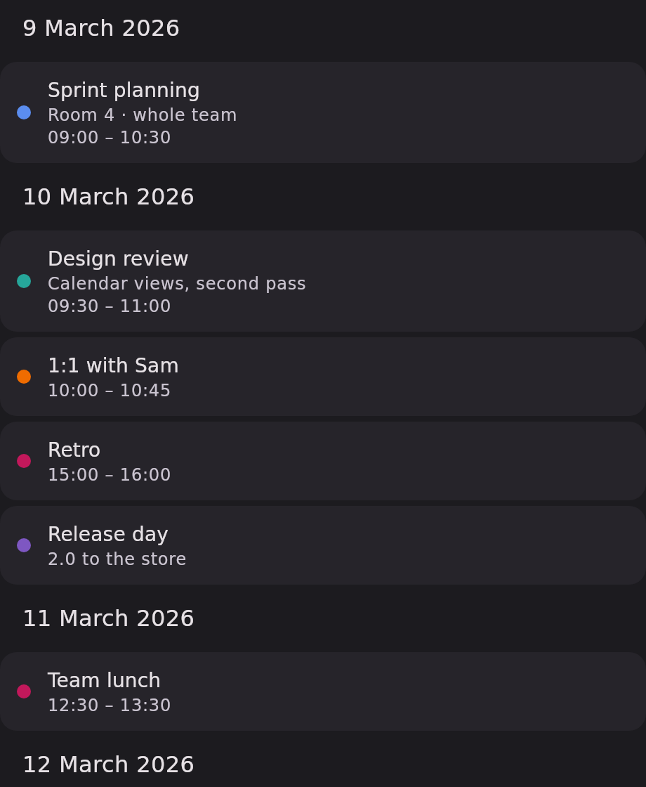
Like every other view, the agenda resolves its visuals through
KalendarTheme. The tokens it uses that no other view does:
| Token | What it colours or sizes |
|---|---|
KalendarColors.agendaCard | The surface behind one event row. |
KalendarShapes.agendaCard | That surface's corners. |
KalendarTypography.agendaEventTitle | The event name, and the empty-state message. |
KalendarTypography.agendaEventSubtitle | The description and the time label. |
KalendarDimensions.agendaRowPadding | Padding inside one row. |
KalendarDimensions.agendaRowSpacing | Gap between rows. |
KalendarDimensions.agendaRowGap | Gap between the dot and the text. |
KalendarDimensions.agendaDotSize | Diameter of the accent dot. |
KalendarStrings.agendaEmptyState | The text shown when there is nothing to list. |
The date header uses KalendarTypography.headerTitle and KalendarDimensions.sectionPadding, shared
with the other views so the type scale stays consistent across a screen that shows more than one.