KalendarYear#
A year overview: one page per year, rendered as a vertically scrollable column of all twelve month
grids. The header's arrow buttons (labelled with the year) and a horizontal swipe drive the same
KalendarViewState.
Use it as a "pick a month" or "year at a glance" screen.
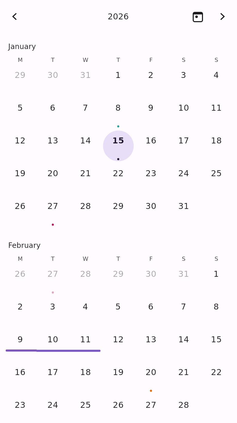
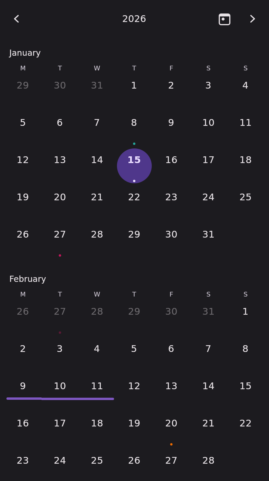
The picture shows the first two of the twelve grids — the column scrolls through the rest.
Minimal example#
import androidx.compose.runtime.Composable
import androidx.compose.runtime.getValue
import androidx.compose.runtime.mutableStateOf
import androidx.compose.runtime.remember
import androidx.compose.runtime.setValue
import com.himanshoe.kalendar.KalendarYear
import com.himanshoe.kalendar.state.rememberKalendarYearState
import kotlinx.datetime.TimeZone
import kotlinx.datetime.todayIn
import kotlin.time.Clock

@Composable
fun YearOverview() {
    val today = remember { Clock.System.todayIn(TimeZone.currentSystemDefault()) }
    val state = rememberKalendarYearState(initialDate = today)
    var selected by remember { mutableStateOf(setOf(today)) }

    KalendarYear(
        selectedDate = today,
        state = state,
        selectedDates = selected,
        onDateClick = { date, _ -> selected = setOf(date) },
    )
}Parameters#
| Parameter | Type | Default | Description |
|---|---|---|---|
selectedDate | LocalDate | — | Default single-selection highlight, and the initially visible year when state is left at its default. Superseded by selectedDates when that is passed. |
modifier | Modifier | Modifier | Applied to the outermost container. |
state | KalendarViewState | rememberKalendarYearState(selectedDate) | Navigation state. Hoist it to read visibleDate or navigate from your own UI. |
events | List<E> | emptyList() | Shown as indicator dots on day cells, and as span bars for multi-day events, across all twelve grids. |
selectedDates | Set<LocalDate> | setOf(selectedDate) | The highlighted dates. Hoist your own set for multi-select or range. |
onDateClick | (date: LocalDate, events: List<E>) -> Unit | no-op | Called when a non-disabled date is tapped, with that date's events. |
onDayEventClick | ((event: E) -> Unit)? | null | Called when an individual event is tapped inside a day cell's +N overflow popover. |
config | KalendarViewConfig | KalendarViewConfig() | Shared visual and behavioural settings. See Configuration. |
header | @Composable (KalendarHeaderScope) -> Unit | KalendarHeaderDefaults.Header | Replaces the navigation header above the year. See Customization. |
dayOfWeekLabel | @Composable (DayOfWeek) -> Unit | KalendarHeaderDefaults.DayOfWeekLabel | Replaces the content of each weekday column header, on every month grid. |
dayContent | (@Composable (scope: KalendarDayScope<E>) -> Unit)? | null | Replaces the built-in day cell entirely, on every month grid. See Customization. |
Note: no drag gestures here.
KalendarYearhas noonDateRangeSelect, noonEventDrop, and no sliding selection indicator — twelve grids are on screen at once, so there is no single indicator to slide and no unambiguous drag surface. Multi-select and range selection still work throughselectedDatesandrememberKalendarSelectionState.
State factory#
rememberKalendarYearState.
val state = rememberKalendarYearState(
    initialDate = today,
    startDayOfWeek = DayOfWeek.SUNDAY,
    minDate = LocalDate(2020, 1, 1),
    maxDate = LocalDate(2030, 12, 31),
)| Parameter | Type | Default | Description |
|---|---|---|---|
initialDate | LocalDate | today | The year initially visible. |
startDayOfWeek | DayOfWeek | MONDAY | The first column of every month grid. |
minDate | LocalDate? | null | Turns canScrollBackward false once the previous year would start before this date's year. |
maxDate | LocalDate? | null | Turns canScrollForward false once the next year would start after this date's year. |
Layout#
Each month is a section: its name — from
KalendarViewConfig.monthNameFormatter, styled with
KalendarTypography.monthLabel — above a static, non-scrolling grid. Sections are separated by
KalendarDimensions.monthSpacing (16.dp) and the names are inset by
KalendarDimensions.sectionPadding.
The whole column is one verticalScroll, and the grids inside it are eager rather than lazy. That
is deliberate: a lazy grid nested inside a scrollable parent crashes on Android and iOS.
Twelve grids is a lot of vertical space. KalendarDimensions lets you compress
them:
KalendarTheme(
    dimensions = KalendarTheme.dimensions.copy(
        dayCellPadding = 0.dp,
        monthSpacing = 8.dp,
    ),
) {
    KalendarYear(selectedDate = today)
}