KalendarSchedule#
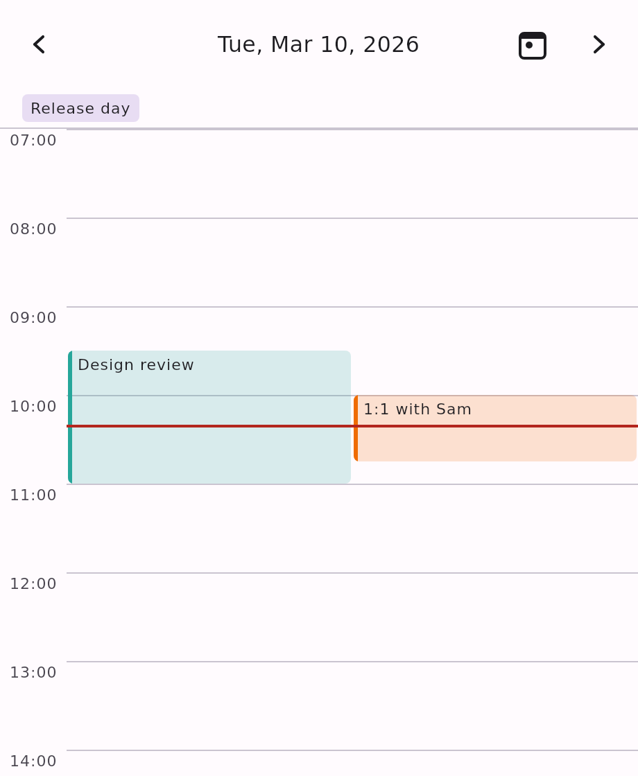
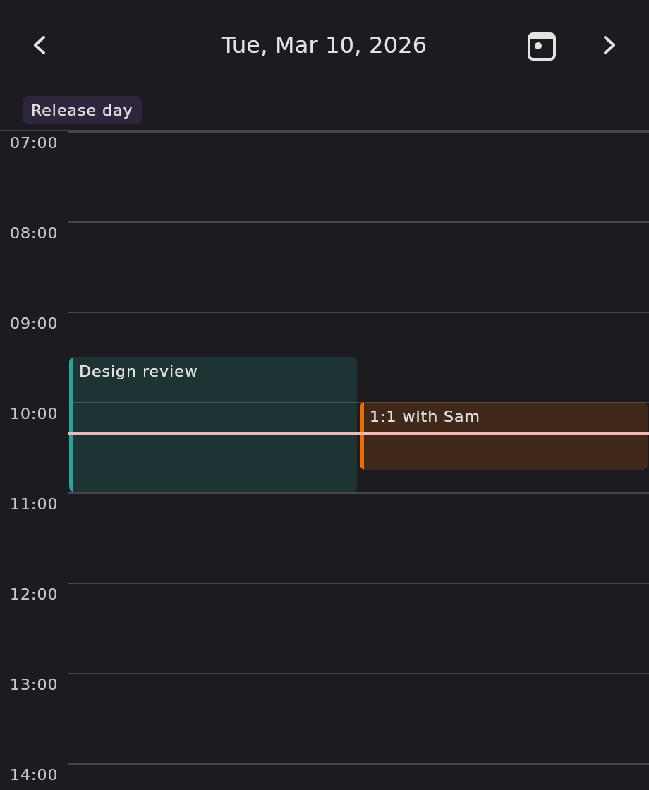
An hourly time grid for a single day — the "day view" of a typical calendar app. One day per page, navigable by arrow-click and swipe.
Timed events (those with a non-null startTime) render as blocks sized by their duration.
Overlapping events pack side by side. All-day events (no startTime) pin as chips above the grid. A
now-indicator line marks the current time on today's page, refreshing every minute. On first
composition the grid starts scrolled to early morning rather than midnight.
Minimal example#
import androidx.compose.ui.graphics.Color
import com.himanshoe.kalendar.foundation.event.BasicKalendarEvent
import com.himanshoe.kalendar.KalendarSchedule
import com.himanshoe.kalendar.state.rememberKalendarScheduleState
import kotlinx.datetime.LocalDate
import kotlinx.datetime.LocalDateTime
import kotlinx.datetime.LocalTime

val today = LocalDate(2026, 8, 12)

KalendarSchedule(
    state = rememberKalendarScheduleState(initialDate = today),
    events = listOf(
        BasicKalendarEvent(
            date = today,
            eventName = "Design review",
            startTime = LocalDateTime(today, LocalTime(9, 0)),
            endTime = LocalDateTime(today, LocalTime(10, 0)),
            eventColor = Color(0xFFEF6C00),
        ),
    ),
    onEventClick = { event -> openDetails(event) },
)Parameters#
| Parameter | Type | Default | Description |
|---|---|---|---|
modifier | Modifier | Modifier | Applied to the outermost container. |
state | KalendarViewState | rememberKalendarScheduleState() | Navigation state — pages by single day. Pass one built with initialDate to open on a day other than today. |
events | List<E> | emptyList() | Events for the calendar; only those on the visible day are rendered. |
onEventClick | (E) -> Unit | no-op | Called when an event block or all-day chip is tapped. |
onEventTimeChange | ((event: E, newStart: LocalDateTime, newEnd: LocalDateTime) -> Unit)? | null | When non-null, blocks become draggable, and resizable from either edge. See Drag to move and resize. |
onEventCreate | ((start: LocalDateTime, end: LocalDateTime) -> Unit)? | null | When non-null, a press-and-drag on empty grid sweeps out a new time range and reports it on release. |
config | KalendarViewConfig | KalendarViewConfig() | Shared settings. scheduleVisibleHours, scheduleInitialScrollHour and scheduleDragSnapMinutes all apply; disabledDates and showAdjacentMonthDates do not. See Configuration. |
hourHeight | Dp | KalendarTheme.dimensions.hourHeight | Vertical space for one hour; block heights scale with it. Defaults to the theme's hourHeight (64.dp). |
nowIndicatorTick | Duration | 1.minutes | How often the now-indicator re-reads the clock. |
allDayEventContent | @Composable (E) -> Unit | KalendarScheduleDefaults.AllDayChip | Slot for one all-day chip in the row above the grid. |
hourLabel | @Composable (Int) -> Unit | KalendarScheduleDefaults.HourLabel | Slot for one hour-gutter label, given the absolute hour as 0..23. |
nowIndicator | @Composable () -> Unit | KalendarScheduleDefaults.NowIndicator | Slot for the current-time line. The grid owns its vertical offset and only draws it on today. |
eventContent | @Composable (KalendarScheduleEventScope<E>) -> Unit | KalendarScheduleDefaults.EventBlock | Slot for one timed event block. Last, so trailing-lambda syntax lands on the view's primary slot. |
Note: there is no
selectedDateparameter. The Schedule views have no concept of date selection, so the day on screen is entirely thestate's business — build one withrememberKalendarScheduleState(initialDate = …)to open somewhere other than today.
See Customization for what the content slots receive and how to fall back to the built-in rendering.
State factory#
rememberKalendarScheduleState — the only factory with no startDayOfWeek, since a single day has
no week columns to align.
val state = rememberKalendarScheduleState(
    initialDate = today,
    minDate = LocalDate(2026, 1, 1),
    maxDate = LocalDate(2026, 12, 31),
)| Parameter | Type | Default | Description |
|---|---|---|---|
initialDate | LocalDate | today | The day initially visible. |
minDate | LocalDate? | null | Turns canScrollBackward false at this date. |
maxDate | LocalDate? | null | Turns canScrollForward false at this date. |
timeSource | KalendarTimeSource | the ambient one | Where the state reads "today" from. Hand it a fixed clock to make a test or a screenshot deterministic. |
How events are laid out#
| Event shape | Result |
|---|---|
startTime and endTime set | A block from start to end. |
startTime set, endTime null | A block one hour long. |
No startTime | Treated as all-day: a chip in the row above the grid, not on it. |
| Spans midnight | Truncated at the day's edges on every page it touches. |
| Shorter than 15 minutes | Rendered 15 minutes tall, so it stays tappable. |
| Overlapping others | Packed into side-by-side columns; every member of an overlap cluster divides the width by the same count, so blocks stay aligned. |
eventColor tints the block's accent stripe and its fill (the fill at
KalendarColors.eventBlockAlpha), falling back to KalendarColors.eventIndicator.
The grid scrolls to KalendarViewConfig.scheduleInitialScrollHour (7 by default) when a page first
appears.
Drag to move and resize#
When onEventTimeChange is set, blocks become draggable:
- Press and hold, then drag — moves the whole event, preserving its duration.
- Press and hold the block's bottom edge, then drag — resizes it, moving only the end time. The
grab strip is
KalendarDimensions.eventBlockResizeHandleHeight(12.dp) tall.
Movement snaps to KalendarViewConfig.scheduleDragSnapMinutes (15 by default). A long press is
required so an ordinary drag still scrolls the grid.
The callback fires on release with the event and its new start and end. The calendar never mutates events — update your own source:
var events by remember { mutableStateOf(initialEvents) }

KalendarSchedule(
    events = events,
    onEventTimeChange = { event, newStart, newEnd ->
        events = events.map { existing ->
            if (existing === event && existing is BasicKalendarEvent) {
                existing.copy(date = newStart.date, startTime = newStart, endTime = newEnd)
            } else {
                existing
            }
        }
    },
)
Warning:
KalendarEventis an interface with nocopy— only the concrete implementation has one. Also remember to movedatealong withstartTime: onKalendarScheduleWeeka horizontal drag can change the day, andnewStartcarries the shifted date. Dropping it would leave the event on its old date with a new time.
A drag that reaches the bottom of the day reports an end of 00:00 on the following date, since
LocalTime cannot express 24:00. Handle that when you write the change back.
Theming#
Both Schedule views resolve everything through the ambient KalendarTheme:
| Element | Token |
|---|---|
| Hour lines and separators | KalendarColors.gridLine, KalendarDimensions.gridLineThickness |
| Current-time line | KalendarColors.nowIndicator, KalendarDimensions.nowIndicatorThickness |
| Event block fill | The event's accent at KalendarColors.eventBlockAlpha, or eventBlockDraggingAlpha while dragging |
| Event block accent stripe | KalendarDimensions.eventBlockAccentWidth (set to 0.dp to remove it) |
| Block corner radius | KalendarShapes.eventBlock |
| Hour gutter width | KalendarDimensions.hourGutterWidth |
| Hour labels | KalendarTypography.hourLabel, KalendarColors.dayLabelContent |
| Event labels | KalendarTypography.eventLabel |
To change the hour height for one calendar only, pass hourHeight; to change it everywhere, set
KalendarDimensions.hourHeight on the theme.
The week variant#
KalendarScheduleWeek is the seven-day version: day columns sharing one hour
gutter, with the same layout, drag, and theming behaviour.