KalendarScheduleWeek#
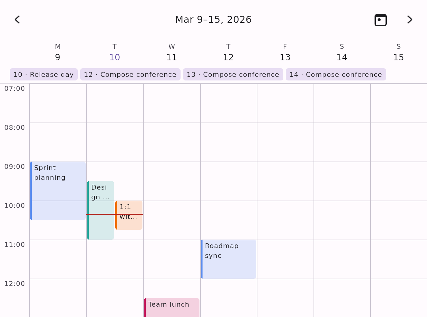
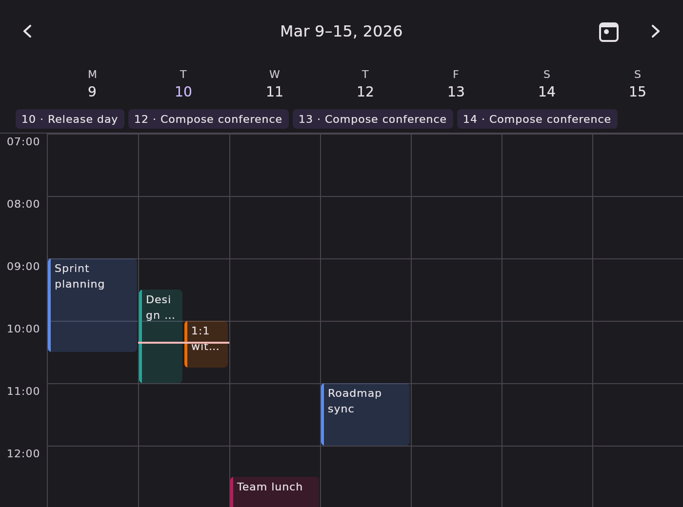
The seven-day hourly time grid — KalendarSchedule's week variant, paged by week.
Seven day columns share a single hour gutter. Each column lays out its own day's timed events as duration-sized blocks with the same overlap packing. A header row shows each day's label and date with today emphasised. All-day events pin as chips above the grid, prefixed with the day of month they belong to, because one row is shared by all seven columns. The now-indicator appears only on today's column.
Minimal example#
import com.himanshoe.kalendar.KalendarScheduleWeek
import com.himanshoe.kalendar.state.rememberKalendarWeekState

KalendarScheduleWeek(
    state = rememberKalendarWeekState(initialDate = today),
    events = events,
    onEventClick = { event -> openDetails(event) },
)Parameters#
| Parameter | Type | Default | Description |
|---|---|---|---|
modifier | Modifier | Modifier | Applied to the outermost container. |
state | KalendarViewState | rememberKalendarWeekState() | Navigation state — pages by week. Note this is the week factory, not a schedule-specific one. Pass one built with initialDate to open on a week other than this one. |
events | List<E> | emptyList() | Events for the calendar; only those in the visible week are rendered. |
onEventClick | (E) -> Unit | no-op | Called when an event block or all-day chip is tapped. |
onEventTimeChange | ((event: E, newStart: LocalDateTime, newEnd: LocalDateTime) -> Unit)? | null | When non-null, blocks become draggable and resizable from either edge, and a horizontal drag moves the event across day columns. See Dragging across days. |
onEventCreate | ((start: LocalDateTime, end: LocalDateTime) -> Unit)? | null | When non-null, a press-and-drag on empty grid sweeps out a new time range and reports it on release. |
config | KalendarViewConfig | KalendarViewConfig() | Shared settings. visibleDaysOfWeek narrows the column count and scheduleVisibleHours narrows the hours; disabledDates and showAdjacentMonthDates have no effect. See Configuration. |
hourHeight | Dp | KalendarTheme.dimensions.hourHeight | Vertical space for one hour; block heights scale with it. Defaults to the theme's hourHeight (64.dp). |
nowIndicatorTick | Duration | 1.minutes | How often the now-indicator re-reads the clock. |
allDayEventContent | @Composable (E) -> Unit | KalendarScheduleDefaults.AllDayChip, prefixed with the day of month | Slot for one all-day chip. |
hourLabel | @Composable (Int) -> Unit | KalendarScheduleDefaults.HourLabel | Slot for one hour-gutter label, given the absolute hour as 0..23. |
nowIndicator | @Composable () -> Unit | KalendarScheduleDefaults.NowIndicator | Slot for the current-time line. Drawn only on today's column; the grid owns its offset. |
dayHeader | @Composable (date: LocalDate, isToday: Boolean) -> Unit | KalendarScheduleDefaults.WeekDayHeader | Slot for one day column's header. Filled to the column's width. |
eventContent | @Composable (KalendarScheduleEventScope<E>) -> Unit | KalendarScheduleDefaults.EventBlock | Slot for one timed event block. Last, so trailing-lambda syntax lands on the view's primary slot. |
Note: as on
KalendarSchedule, there is noselectedDateparameter — the Schedule views have no date selection, so the visible week is thestate's business alone.
Everything KalendarSchedule documents about
event layout, dragging,
and theming applies here unchanged. This page covers only what differs.
State factory#
rememberKalendarWeekState — shared with KalendarWeek, so the two views can be driven
by the same hoisted state and stay on the same week.
val state = rememberKalendarWeekState(
    initialDate = today,
    startDayOfWeek = DayOfWeek.SUNDAY,
)

Column {
    KalendarWeek(selectedDate = today, state = state)
    KalendarScheduleWeek(state = state)
}| Parameter | Type | Default | Description |
|---|---|---|---|
initialDate | LocalDate | today | The week initially visible. |
startDayOfWeek | DayOfWeek | MONDAY | Which day is the leftmost column. |
minDate | LocalDate? | null | Bounds the previous arrow button. |
maxDate | LocalDate? | null | Bounds the next arrow button. |
timeSource | KalendarTimeSource | the ambient one | Where the state reads "today" from. Hand it a fixed clock to make a test or a screenshot deterministic. |
Dragging across days#
With onEventTimeChange set, a drag behaves as it does on the day view — vertical movement changes
the time, a bottom-edge drag resizes — and additionally, horizontal movement moves the event
across day columns. The day shift is computed from the full day-column width and clamped to six
days in either direction.
The release callback's newStart and newEnd carry the shifted date, not just a new time, so
write both back:
KalendarScheduleWeek(
    events = events,
    onEventTimeChange = { event, newStart, newEnd ->
        events = events.map { existing ->
            if (existing === event && existing is BasicKalendarEvent) {
                existing.copy(
                    date = newStart.date,
                    startTime = newStart,
                    endTime = newEnd,
                )
            } else {
                existing
            }
        }
    },
)
Warning: dropping
date = newStart.dateis the classic bug here — the event visually jumps back to its old column on the next recomposition, because the grid places blocks byKalendarEvent.date, not bystartTime's date.
The all-day row#
All seven days share one all-day row, so a chip has to say which day it belongs to. The default
allDayEventContent calls KalendarScheduleDefaults.AllDayChip with a prefix of the day of
month, rendering as 12 · Conference.
A replacement slot receives only the KalendarEvent, so if you need the prefix, pass it to the
built-in chip:
KalendarScheduleWeek(
    events = events,
    allDayEventContent = { event ->
        KalendarScheduleDefaults.AllDayChip(event = event, prefix = event.date.day.toString())
    },
)
The day header#
dayHeader is given the column's date and whether it is today, and is stretched to the column's
width. The default draws the day-of-week label (from
KalendarViewConfig.dayOfWeekLabelFormatter) above the date number, with the
number in KalendarColors.todayContent when it is today.
KalendarScheduleWeek(
    dayHeader = { date, isToday ->
        Column(horizontalAlignment = Alignment.CenterHorizontally) {
            Text(text = date.dayOfWeek.name.take(3))
            Text(
                text = date.day.toString(),
                color = if (isToday) KalendarTheme.colors.todayContent else KalendarTheme.colors.dayContent,
            )
        }
    },
)
The hour gutter#
The gutter is KalendarDimensions.hourGutterWidth (48.dp) wide, and the day-header row reserves a
spacer of exactly that width so the columns line up with the grid below. Changing the token moves
both together — that is why it is a theme token rather than a parameter.