KalendarMonth#
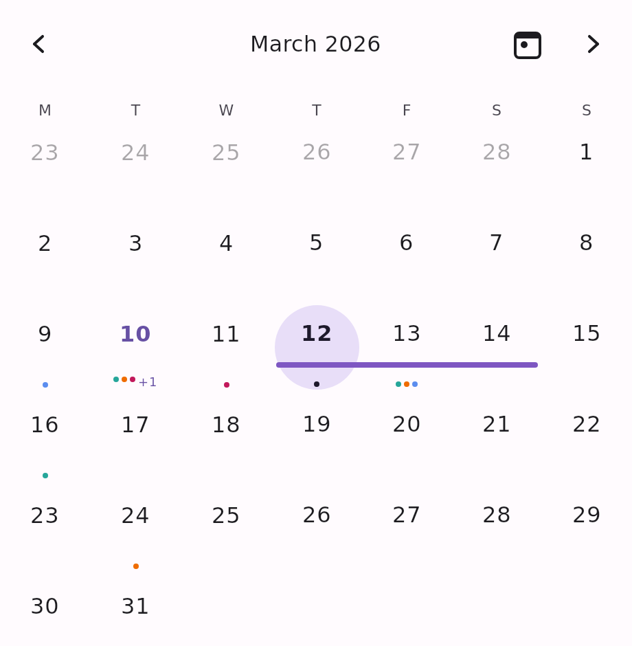
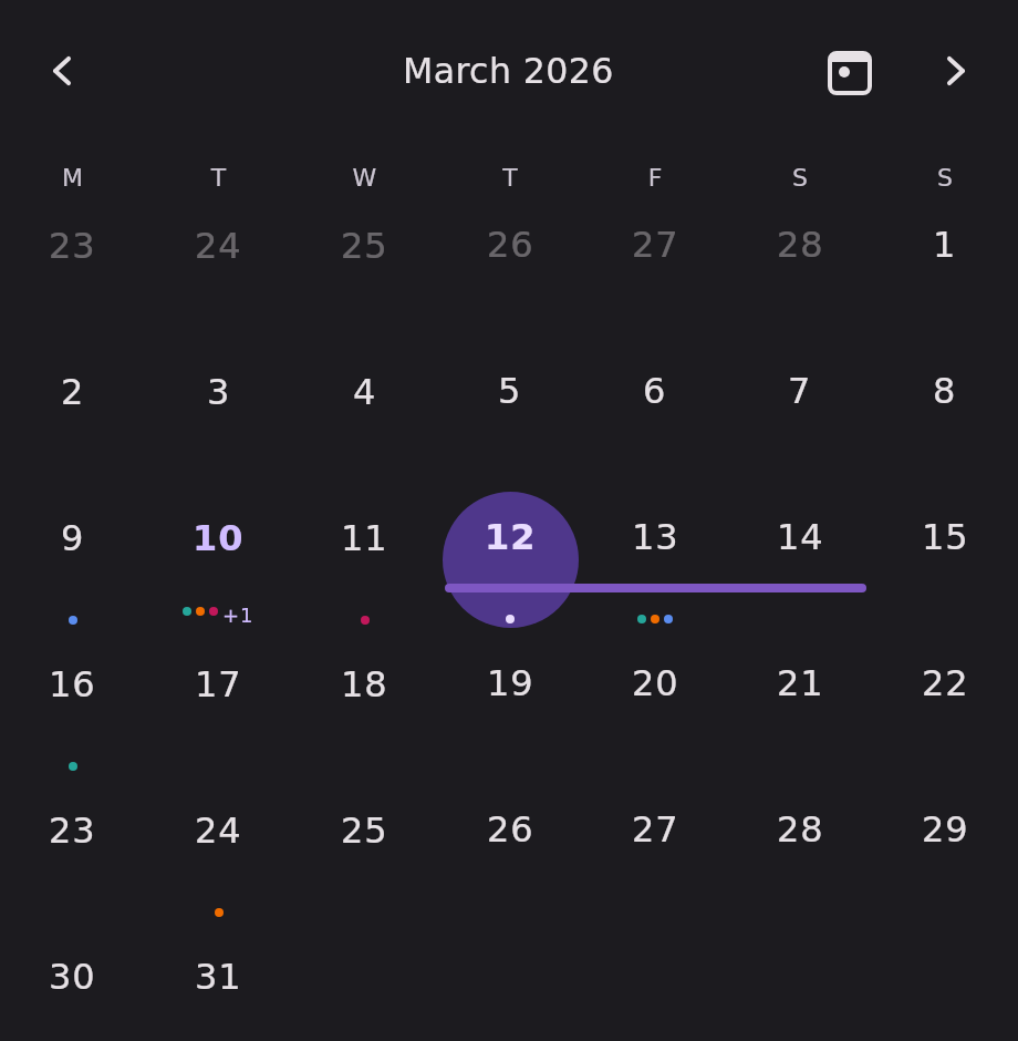
The full month grid — seven columns, one page per month. The header's arrow buttons and a horizontal
swipe drive the same KalendarViewState, so they always stay in sync.
This is the most capable of the date-grid views: it is the only one with drag-to-reschedule.
Minimal example#
import androidx.compose.runtime.Composable
import androidx.compose.runtime.getValue
import androidx.compose.runtime.mutableStateOf
import androidx.compose.runtime.remember
import androidx.compose.runtime.setValue
import com.himanshoe.kalendar.KalendarMonth
import com.himanshoe.kalendar.state.rememberKalendarMonthState
import kotlinx.datetime.TimeZone
import kotlinx.datetime.todayIn
import kotlin.time.Clock

@Composable
fun MonthGrid() {
    val today = remember { Clock.System.todayIn(TimeZone.currentSystemDefault()) }
    val state = rememberKalendarMonthState(initialDate = today)
    var selected by remember { mutableStateOf(setOf(today)) }

    KalendarMonth(
        selectedDate = today,
        state = state,
        selectedDates = selected,
        onDateClick = { date, _ -> selected = setOf(date) },
    )
}Parameters#
| Parameter | Type | Default | Description |
|---|---|---|---|
selectedDate | LocalDate | — | Default single-selection highlight, and the initially visible month when state is left at its default. Superseded by selectedDates when that is passed. |
modifier | Modifier | Modifier | Applied to the outermost container. |
state | KalendarViewState | rememberKalendarMonthState(selectedDate) | Navigation state. Hoist it to read visibleDate or navigate from your own UI. |
events | List<E> | emptyList() | Shown as indicator dots on day cells, and as span bars for multi-day events. |
selectedDates | Set<LocalDate> | setOf(selectedDate) | The highlighted dates. Hoist your own set for multi-select or range. |
onDateClick | (date: LocalDate, events: List<E>) -> Unit | no-op | Called when a non-disabled date is tapped, with that date's events. |
onDayEventClick | ((event: E) -> Unit)? | null | Called when an individual event is tapped inside a day cell's +N overflow popover. |
onDateRangeSelect | ((start: LocalDate, current: LocalDate) -> Unit)? | null | When non-null, press-and-hold then drag selects a range live. |
onDateRangeSelectEnd | (() -> Unit)? | null | Called once when a drag started by onDateRangeSelect ends. |
onEventDrop | ((events: List<E>, newDate: LocalDate) -> Unit)? | null | When non-null, press-and-hold a date that has events and drag to another date to reschedule. See Drag to reschedule. |
config | KalendarViewConfig | KalendarViewConfig() | Shared visual and behavioural settings. See Configuration. |
header | @Composable (KalendarHeaderScope) -> Unit | KalendarHeaderDefaults.Header | Replaces the navigation header above the grid. See Customization. |
dayOfWeekLabel | @Composable (DayOfWeek) -> Unit | KalendarHeaderDefaults.DayOfWeekLabel | Replaces the content of each weekday column header. |
dayContent | (@Composable (scope: KalendarDayScope<E>) -> Unit)? | null | Replaces the built-in day cell entirely. See Customization. |
State factory#
rememberKalendarMonthState.
val state = rememberKalendarMonthState(
    initialDate = today,
    startDayOfWeek = DayOfWeek.SUNDAY,
    minDate = LocalDate(2020, 1, 1),
    maxDate = LocalDate(2030, 12, 31),
)| Parameter | Type | Default | Description |
|---|---|---|---|
initialDate | LocalDate | today | The month initially visible. |
startDayOfWeek | DayOfWeek | MONDAY | The grid's first column. |
minDate | LocalDate? | null | Turns canScrollBackward false once the previous month would start before this date's month. |
maxDate | LocalDate? | null | Turns canScrollForward false once the next month would start after this date's month. |
Bounds are compared in page space, so a minDate that falls mid-month (say the 15th) still lets
you reach the month that contains it.
Adjacent-month dates#
A month grid needs leading and trailing padding days to complete its first and last weeks.
KalendarViewConfig.showAdjacentMonthDates decides what happens to them:
| Value | Result |
|---|---|
true (default) | The neighbouring month's dates are drawn dimmed, at KalendarColors.disabledContentAlpha. |
false | Those cells are blank placeholders that still hold the grid's alignment. |
Either way, adjacent-month dates are not tappable — they count as disabled.
Selection#
selectedDates is a plain hoisted set, so a tap does whatever you say it does. For single, multiple,
and range behaviour, rememberKalendarSelectionState implements the tap logic and survives
configuration changes and process death:
val selection = rememberKalendarSelectionState(mode = KalendarSelectionMode.Range)

KalendarMonth(
    selectedDate = today,
    selectedDates = selection.selectedDates,
    onDateClick = { date, _ -> selection.onDateClick(date) },
)
For a hand-rolled range, LocalDate.datesUntil(other) returns every date between the two, inclusive,
in either order:
import com.himanshoe.kalendar.foundation.datetime.datesUntil

var rangeStart by remember { mutableStateOf<LocalDate?>(null) }
var rangeEnd by remember { mutableStateOf<LocalDate?>(null) }
val start = rangeStart
val end = rangeEnd

KalendarMonth(
    selectedDate = today,
    selectedDates = if (start != null && end != null) start.datesUntil(end) else emptySet(),
    onDateClick = { date, _ ->
        if (rangeStart == null || rangeEnd != null) {
            rangeStart = date
            rangeEnd = null
        } else {
            rangeEnd = date
        }
    },
)
Sliding selection indicator#
When exactly one date is selected, a single shared indicator slides between cells rather than each
cell fading independently. On by default; turn it off with
KalendarViewConfig(showSelectionIndicator = false). It is drawn behind the cell, so a custom
dayContent keeps the animation.
Drag to select a range#
val selection = rememberKalendarSelectionState(mode = KalendarSelectionMode.Range)

KalendarMonth(
    selectedDate = today,
    selectedDates = selection.selectedDates,
    onDateClick = { date, _ -> selection.onDateClick(date) },
    onDateRangeSelect = selection::onRangeDrag,
    onDateRangeSelectEnd = selection::onRangeDragEnd,
)
A long press is required before the drag begins, so a quick tap still reaches onDateClick.
Drag to reschedule#
With onEventDrop set, press and hold a date that has events, then drag: a ghost highlight
follows the cell under the pointer, and releasing calls the callback with the pressed date's events
and the drop date.
The calendar never mutates your events — update your own source to complete the move:
var events by remember { mutableStateOf(initialEvents) }

KalendarMonth(
    selectedDate = today,
    events = events,
    onEventDrop = { dropped, newDate ->
        events = events.map { event ->
            if (event in dropped && event is BasicKalendarEvent) {
                event.copy(date = newDate, endDate = null)
            } else {
                event
            }
        }
    },
)
Warning:
KalendarEventis an interface — it has nocopy. Only the concrete implementation does. Smart-cast toBasicKalendarEvent(as above) or rebuild the event from your own domain model. And copying a multi-day event onto a new start date without also moving itsendDatewill silently change the event's length, so decide explicitly what should happen to the span.
Dates without events fall through to onDateRangeSelect's range behaviour, so drag-to-reschedule
and drag-to-select can both be enabled at once.
Events on the grid#
Each day cell draws one dot per single-day event, coloured by KalendarEvent.eventColor and falling
back to KalendarColors.eventIndicator. Past KalendarViewConfig.eventIndicatorCap (3 by default)
the remainder collapses into a compact +N label.
A multi-day event (KalendarEvent.endDate) draws as a continuous bar across the days it covers,
not as a dot on each of them. The bar runs edge to edge so adjacent cells join, and it breaks at the
week boundary — a Thursday-to-Tuesday event is two bars, one per grid row. Its real start and end
are inset and rounded; an end that is only the row running out stays square and flush, which is what
distinguishes an event that finished on Saturday from one that continues into Sunday.
Overlapping spans pack into lanes, capped at KalendarDimensions.spanBarMaxLanes (2 by
default). A span that does not fit the cap is not hidden — it falls back to the indicator dot and
still reaches the +N overflow. Bar height, spacing, corner radius, end inset, and the lane cap are
all dimension tokens; spanBarMaxLanes = 0 turns bars off entirely.
See Events for the full rules.