KalendarTimeline#
A continuous, vertically scrolling calendar: every month, forward and backward, in one list with no page boundaries — scroll from August straight into September into October. Only the months near the current scroll position are ever composed.
This is the Google-Calendar-list shape. There are no arrow buttons; the scroll is the navigation.
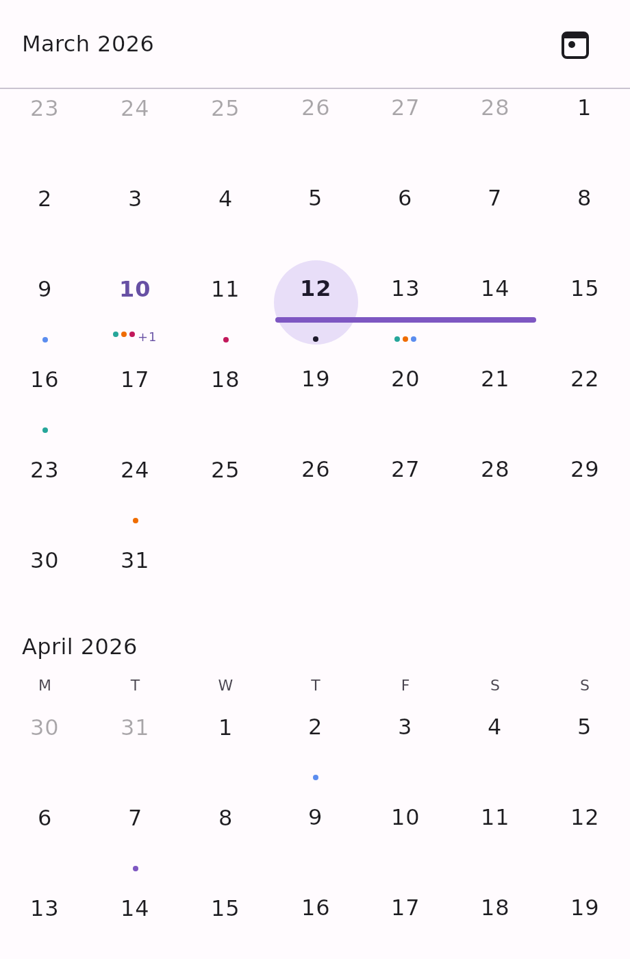
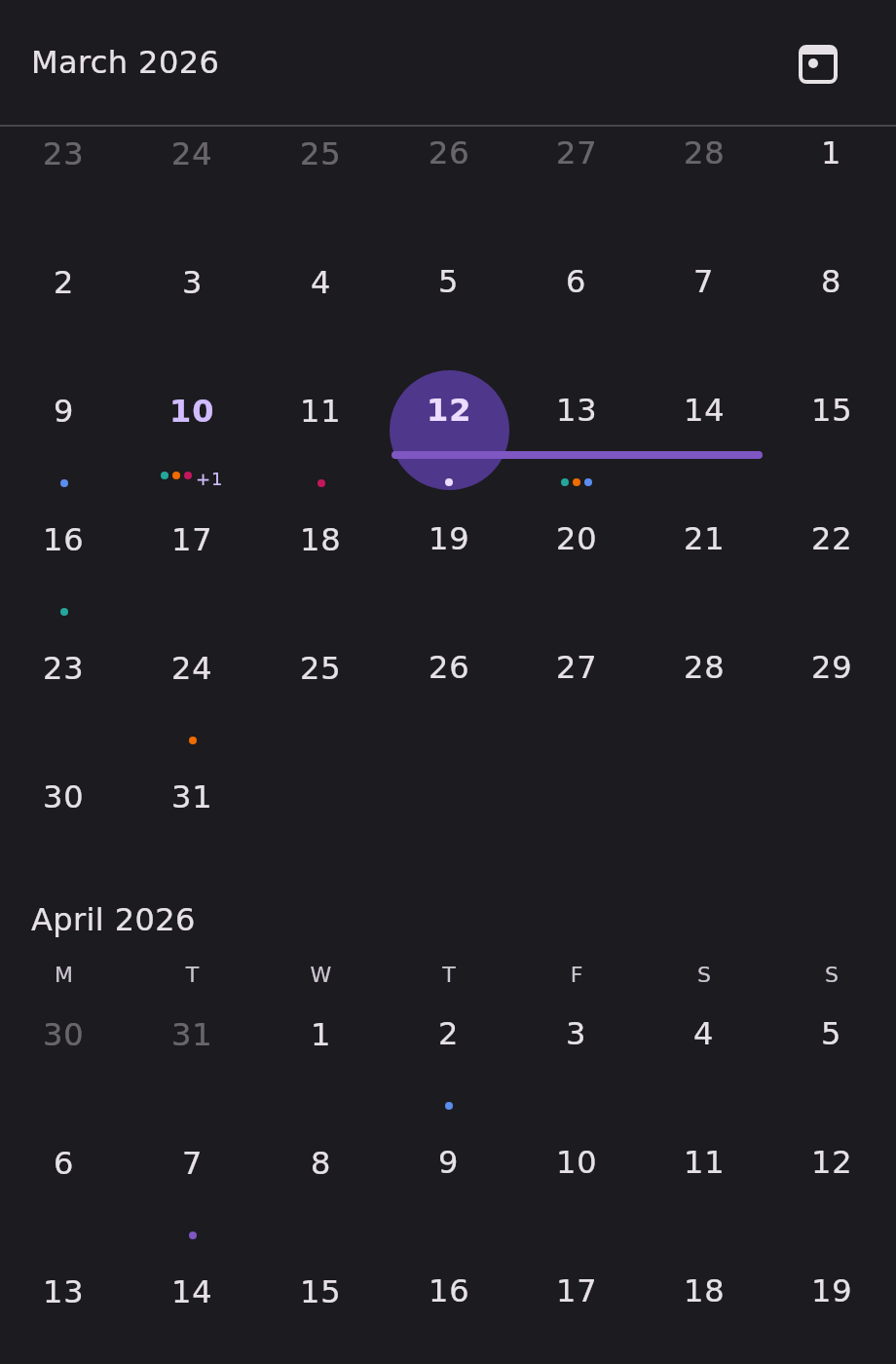
Minimal example#
import androidx.compose.runtime.Composable
import androidx.compose.runtime.getValue
import androidx.compose.runtime.mutableStateOf
import androidx.compose.runtime.remember
import androidx.compose.runtime.setValue
import com.himanshoe.kalendar.KalendarTimeline
import com.himanshoe.kalendar.state.rememberKalendarTimelineState
import kotlinx.datetime.TimeZone
import kotlinx.datetime.todayIn
import kotlin.time.Clock

@Composable
fun Timeline() {
    val today = remember { Clock.System.todayIn(TimeZone.currentSystemDefault()) }
    val state = rememberKalendarTimelineState(initialDate = today)
    var selected by remember { mutableStateOf(setOf(today)) }

    KalendarTimeline(
        selectedDate = today,
        state = state,
        selectedDates = selected,
        onDateClick = { date, _ -> selected = setOf(date) },
    )
}Parameters#
| Parameter | Type | Default | Description |
|---|---|---|---|
selectedDate | LocalDate | — | Default single-selection highlight, and the month initially at the top of the list when state is left at its default. Superseded by selectedDates when that is passed. |
modifier | Modifier | Modifier | Applied to the outermost container. |
state | KalendarTimelineState | rememberKalendarTimelineState(selectedDate) | Scroll state. Hoist it to read visibleDate or scroll from your own UI. |
events | List<E> | emptyList() | Shown as indicator dots on day cells, and as span bars for multi-day events. |
selectedDates | Set<LocalDate> | setOf(selectedDate) | The highlighted dates. Hoist your own set for multi-select or range. |
onDateClick | (date: LocalDate, events: List<E>) -> Unit | no-op | Called when a non-disabled date is tapped, with that date's events. |
onDayEventClick | ((event: E) -> Unit)? | null | Called when an individual event is tapped inside a day cell's +N overflow popover. |
config | KalendarViewConfig | KalendarViewConfig() | Shared visual and behavioural settings. showNavigationArrows and showJumpPicker have no effect here. See Configuration. |
header | @Composable (KalendarHeaderScope) -> Unit | KalendarHeaderDefaults.TimelineHeader | Replaces the sticky overlay pinned above the scrolling months. See The header scope on a timeline. |
dayOfWeekLabel | @Composable (DayOfWeek) -> Unit | KalendarHeaderDefaults.DayOfWeekLabel | Replaces the content of each weekday column header, on every month grid. |
dayContent | (@Composable (scope: KalendarDayScope<E>) -> Unit)? | null | Replaces the built-in day cell entirely. See Customization. |
Note the different header default: KalendarHeaderDefaults.TimelineHeader, not Header. The
timeline's chrome is a different shape — a leading-aligned title, no arrows, and an opaque fill so
the months scroll underneath it.
State factory#
rememberKalendarTimelineState.
val state = rememberKalendarTimelineState(
    initialDate = today,
    startDayOfWeek = DayOfWeek.SUNDAY,
    minDate = LocalDate(2020, 1, 1),
    maxDate = LocalDate(2030, 12, 31),
)| Parameter | Type | Default | Description |
|---|---|---|---|
initialDate | LocalDate | today | The month initially at the top of the list. |
startDayOfWeek | DayOfWeek | MONDAY | The first column of every month grid. |
minDate | LocalDate? | null | The list cannot scroll to a month before this date's month. Unlimited when null. |
maxDate | LocalDate? | null | The list cannot scroll to a month after this date's month. Unlimited when null. |
timeSource | KalendarTimeSource | the ambient one | Where the state reads "today" from. See The clock. |
Unlike the paged views, these bounds clamp the scroll itself — the list is built with a finite item count when both are set, so there is nothing past them to reach.
Programmatic scroll#
val state = rememberKalendarTimelineState(today)
val scope = rememberCoroutineScope()

KalendarTimeline(selectedDate = today, state = state)

Button(onClick = { scope.launch { state.animateScrollTo(LocalDate(2026, 12, 25)) } }) {
    Text("Jump to December")
}
Button(onClick = { scope.launch { state.animateScrollToToday() } }) {
    Text("Today")
}
state.visibleDate is the start of the month currently topmost in the list — useful for a screen
title that tracks the scroll.
The header scope on a timeline#
The header slot receives the same KalendarHeaderScope as the paged views, but a timeline has no
pages, so the page vocabulary is mapped onto months:
| Member | On a timeline |
|---|---|
title | The topmost visible month, e.g. "August 2026". |
visibleDate | Start of the topmost visible month. |
canScrollBackward / canScrollForward | Always true — the scroll itself is clamped to minDate / maxDate, so a header never has to disable its own arrows. |
goToPreviousPage() / goToNextPage() | Scroll one month back / forward from the topmost visible month. |
goToToday() | Scroll to today's month. |
goTo(date) | Scroll to that date's month. |
KalendarTimeline(
    selectedDate = today,
    header = { scope ->
        Row(verticalAlignment = Alignment.CenterVertically) {
            Text(text = scope.title, style = KalendarTheme.typography.headerTitle)
            Spacer(modifier = Modifier.weight(1f))
            TextButton(onClick = scope::goToToday) { Text("Today") }
        }
    },
)
Warning: the header overlay sits on top of the scrolling list, so a replacement must paint an opaque background of its own — otherwise the months scroll visibly underneath it. The built-in
KalendarHeaderDefaults.TimelineHeadertakes abackground: Brush?for exactly this; passKalendarViewConfig.backgroundwhen the calendar has a custom one.
Differences from the other grid views#
- No arrow buttons, so
KalendarViewConfig.showNavigationArrowsis ignored. - No month/year jump picker — the sticky title is not tappable — so
KalendarViewConfig.showJumpPickeris ignored. - No
onDateRangeSelectand no sliding selection indicator: the timeline holds many grids in one scrolling list rather than one grid per page. - No
onEventDrop.
KalendarViewConfig.showTodayButton does apply — it controls the button in the sticky header.
Multi-day events, selection modes, and locale formatters all behave exactly as they do on
KalendarMonth.