Pie3DChart#
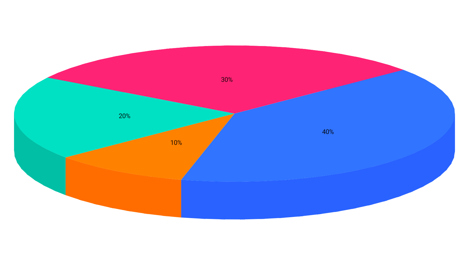
A pie or ring given thickness and tilted. Best when a part-to-whole figure is the headline and the shares are read from labels or a legend.
From the charty-3d artifact, and @ChartyExperimental — see that page for the opt-in.
Pie3DChart( data = { listOf( PieData(label = "Direct", value = 40f), PieData(label = "Search", value = 30f), PieData(label = "Social", value = 20f), PieData(label = "Email", value = 10f), ) }, modifier = Modifier.fillMaxWidth().height(300.dp), pieConfig = Pie3DChartConfig(labelContent = Pie3DLabelContent.PERCENTAGE), onSliceClick = { slice -> println(slice.label) },)Each slice is built as a wedge with a top surface, an outer wall and a radial cut either side. Slices are painted furthest first, and within a slice its walls are painted before its top — a disc seen from above always shows a slice's top in front of that same slice's sides.
The readability cost, plainly#
A flat pie already asks the eye to compare angles, which people do poorly. Tilting it makes that
worse in a specific way: the slices nearest the viewer show their walls, so they present more ink
than slices of the same value at the back. The chart cannot correct for it. Read the shares from
the labels, not the shapes — or use PieChart, or better a bar chart, when
the comparison is the point.
Thickness, ring, explode#
pieConfig = Pie3DChartConfig( thicknessFraction = 0.18f, // depth as a fraction of the radius; 0f draws a flat pie holeFraction = 0.45f, // inner radius as a fraction of the outer; 0f is a solid pie explodeFraction = 0.12f, // pushes every slice out along its own mid-angle)Exploding moves each slice along its own mid-angle, so the gap opens evenly rather than shearing the disc to one side.
Labels#
pieConfig = Pie3DChartConfig( labelContent = Pie3DLabelContent.NAME_AND_PERCENTAGE, minimumSharePercentageForLabel = 5f,)labelContent | Reads |
|---|---|
NONE (default) | nothing — the legend or a tap names the slice |
NAME | the slice's label |
PERCENTAGE | its share of the whole |
NAME_AND_PERCENTAGE | both |
Slices thinner than minimumSharePercentageForLabel go unlabelled, because their label cannot fit
inside them and would overlap their neighbours'.
Smoothness#
pieConfig = Pie3DChartConfig(arcSegments = 72)How many straight edges approximate a full circle. Higher is smoother and costs more geometry; the default is smooth at any size a chart is drawn at. Each slice's top is a single polygon rather than a fan, so no seams show across it.
Viewing angle#
See Projection3D. A pitch of 0f would show the disc exactly edge-on and
hide every slice, so the chart holds the shallowest view just clear of that.
Interaction#
onSliceClick resolves nearest face first, so a tap selects the slice you can see.
Configuration#
Pie3DChartConfig(projection, thicknessFraction, holeFraction, arcSegments, explodeFraction, animation, labelContent, labelStyle, minimumSharePercentageForLabel, plotBackground).
Limitations#
- Depth carries no data; see the artifact page.
- No tooltip slot, crosshair, legend, or rolling window.