HorizontalBarChart#
Best for long category labels or ranked lists where horizontal reading is more natural.
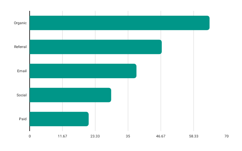
HorizontalBarChart( data = { listOf( BarData(label = "Category A", value = 340f), BarData(label = "Category B", value = 210f), BarData(label = "Category C", value = 480f), ) }, modifier = Modifier.fillMaxWidth().height(250.dp), color = ChartyColor.Solid(Color(0xFF0288D1)), barConfig = BarChartConfig( cornerRadius = CornerRadius.Medium, showDataLabels = true, animation = Animation.Default, ), onBarClick = { barData -> println("Clicked: ${barData.label}") },)Same data and config types as BarChart, rotated: bars grow left-to-right, cornerRadius rounds the leading (value) end, and negative bars extend to the left of the axis.
Corner radius#
barConfig = BarChartConfig(cornerRadius = CornerRadius.Custom(radius = 20f))None, Small, Medium, Large, ExtraLarge, or Custom(radius) with any non-negative value.
Rolling window#
HorizontalBarChart( data = { rankings }, modifier = Modifier.fillMaxWidth().height(250.dp), color = ChartyColor.Solid(Color(0xFF0288D1)), barConfig = BarChartConfig(visibleWindow = 12, animation = Animation.Fast),)visibleWindow keeps only the last N rows on screen and slides as data is appended; null or at least 2.
Persistent markers#
Markers anchor to the centre of each bar's value end. A negative dataIndex counts back from the end of the drawn data, so dataIndex = -1 marks the newest row.
barConfig = BarChartConfig( visibleWindow = 12, markers = listOf(PersistentMarker(dataIndex = -1, label = "Latest")),)Animating value changes#
barConfig = BarChartConfig(animateValueChanges = true, animation = Animation.Fast)Crosshair#
HorizontalBarChart gained a crosshair recently, alongside BarChart. It snaps to the nearest bar as you drag and leaves taps alone.
HorizontalBarChart( data = { rankings }, modifier = Modifier.fillMaxWidth().height(250.dp), color = ChartyColor.Solid(Color(0xFF0288D1)), crosshair = ChartCrosshair(config = ChartCrosshairConfig(showHorizontalLine = false)),)barConfig.crosshairConfig is the older equivalent; the crosshair parameter wins when both are set.
Tooltip#
HorizontalBarChart( data = { rankings }, modifier = Modifier.fillMaxWidth().height(250.dp), color = ChartyColor.Solid(Color(0xFF0288D1)), tooltip = ChartTooltip.compose { Text(text = "${data.label}: ${data.value}") },)ChartTooltip.canvas() is the default; ChartTooltip.none() disables it.
Accessibility#
The chart attaches a generated bar-chart summary plus one focusable node per bar; on a horizontal chart the nodes are laid out top-to-bottom to match the visual order.
interactionConfig = ChartInteractionConfig(accessibilityDescription = "Revenue by category, ranked")Configuration#
HorizontalBarChart uses BarChartConfig; see the full table on the BarChart page.
Limitations#
referenceLineis honoured, butreferenceBandis not drawn on the horizontal chart.