PieChart#
Best for showing the proportional breakdown of a whole into named slices.
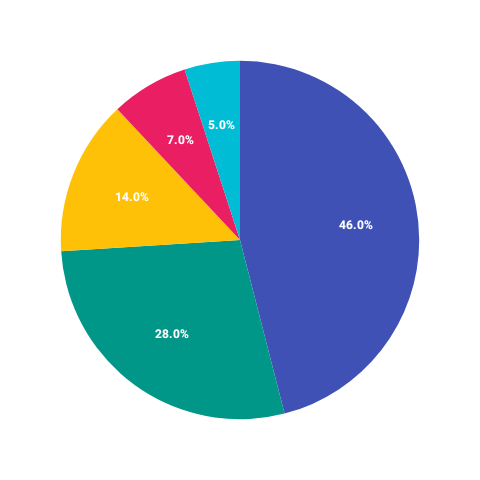
Pie style#
PieChart( data = { listOf( PieData(label = "Product A", value = 40f, color = ChartyColor.Solid(Color(0xFF6650A4))), PieData(label = "Product B", value = 30f, color = ChartyColor.Solid(Color(0xFFE91E63))), PieData(label = "Product C", value = 20f, color = ChartyColor.Solid(Color(0xFF00BCD4))), PieData(label = "Other", value = 10f, color = ChartyColor.Solid(Color(0xFFFFB300))), ) }, modifier = Modifier.size(280.dp), color = ChartyColor.Solid(Color(0xFF6650A4)), config = PieChartConfig( style = PieChartStyle.PIE, animation = Animation.Default, ), onSliceClick = { pieData, index -> println("Tapped: ${pieData.label} (index $index)") }, accessibilityDescription = "Sales breakdown by product category",)PieData.color is a ChartyColor?, not a raw Color. Colour resolution works like this:
- If every slice supplies a
color, those are used. - Otherwise the chart-level
colorsupplies them: aSolidpaints every slice the same, while aGradienthands out its colours one per slice, cycling if there are more slices than colours.
PieData requires a positive value and a non-blank label, and the chart requires the total to be positive.
Donut style#
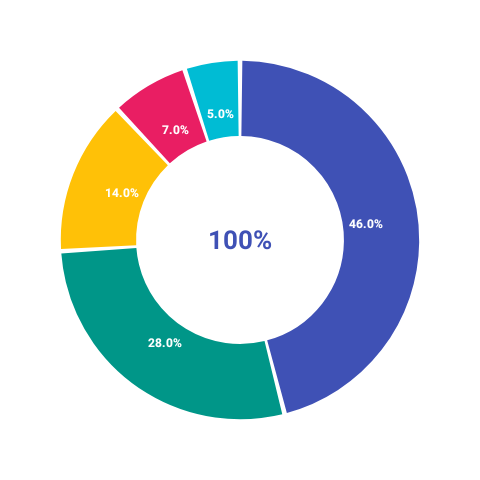
PieChart( data = { listOf( PieData(label = "iOS", value = 55f, color = ChartyColor.Solid(Color(0xFF6650A4))), PieData(label = "Android", value = 35f, color = ChartyColor.Solid(Color(0xFF00BCD4))), PieData(label = "Web", value = 10f, color = ChartyColor.Solid(Color(0xFFE91E63))), ) }, modifier = Modifier.size(280.dp), config = PieChartConfig( style = PieChartStyle.DONUT, donutHoleRatio = 0.55f, sliceSpacingDegrees = 2f, animation = Animation.Default, ), onSliceClick = { pieData, _ -> println("Slice: ${pieData.label}") }, centerContent = { Text(text = "Platform\nShare", textAlign = TextAlign.Center, style = MaterialTheme.typography.labelMedium) }, accessibilityDescription = "Platform distribution: iOS 55%, Android 35%, Web 10%",)centerContent is only rendered in DONUT style — it is ignored for PIE. The same is true of shouldShowCenterText, which draws the total in the hole when no centerContent is supplied.
Slice labels#
config = PieChartConfig( labelConfig = LabelConfig( shouldShowLabels = true, shouldShowPercentage = true, shouldShowValue = false, minimumPercentageToShowLabel = 5f, shouldShowLabelsOutside = true, ),)Slices smaller than minimumPercentageToShowLabel are left unlabelled to avoid overlap.
Selection#
Tapping a slice selects it (tapping again deselects). The selection effect is configured through InteractionConfig — note the type name: it is InteractionConfig, defined alongside PieChartConfig, and not the chart-wide ChartInteractionConfig.
config = PieChartConfig( interactionConfig = InteractionConfig( isEnabled = true, selectedScaleMultiplier = 1.15f, selectedSlicePullOutDistance = 12f, unselectedSliceOpacity = 0.5f, ),)Accessibility#
The chart attaches a generated summary ("Pie chart, 3 slices. Largest slice: … Smallest slice: …"), using "Donut" as the type name in DONUT style. Override it with accessibilityDescription, or pass an empty string to suppress it.
PieChartConfig#
| Property | Type | Default | Description |
|---|---|---|---|
style | PieChartStyle | PIE | PIE (solid disc) or DONUT (ring with a hole) |
donutHoleRatio | Float | 0.5f | Hole size as a fraction of the radius; 0f..0.9f; DONUT only |
startAngleDegrees | Float | -90f | Angle the first slice starts at (12 o'clock) |
labelConfig | LabelConfig | LabelConfig() | Slice label behaviour and styling |
interactionConfig | InteractionConfig | InteractionConfig() | Selection scale, pull-out, and opacity |
animation | Animation | Animation.Default | Sweep-in entry animation |
sliceSpacingDegrees | Float | 0f | Gap between slices; 0f..10f |
shouldShowCenterText | Boolean | false | Draws the total in the donut hole; DONUT only, ignored when centerContent is set |
centerTextStyle | TextStyle | 16 sp, bold, black | Style of that centre text |
LabelConfig#
| Property | Type | Default |
|---|---|---|
shouldShowLabels | Boolean | true |
shouldShowPercentage | Boolean | true |
shouldShowValue | Boolean | false |
minimumPercentageToShowLabel | Float | 3f (0f..100f) |
shouldShowLabelsOutside | Boolean | false |
labelTextStyle | TextStyle | 12 sp, white, bold |
InteractionConfig#
| Property | Type | Default |
|---|---|---|
isEnabled | Boolean | true |
selectedScaleMultiplier | Float | 1.1f (must be >= 1f) |
selectedSlicePullOutDistance | Float | 8f |
selectionAnimationDurationMs | Int | 200 |
enableHoverEffect | Boolean | true |
unselectedSliceOpacity | Float | 0.6f (0f..1f) |
Limitations#
- Not a Cartesian chart: no
visibleWindow, nomarkers, noanimateValueChanges, no crosshair, no tooltip slot, and nointeractionConfig(viewport/brush) parameter. - No legend is drawn; render one yourself from the same
PieDatalist.