AngularGaugeChart#
Best for showing a single value against a fixed range as a speedometer-style dial — KPIs, utilization meters, speed and level indicators.
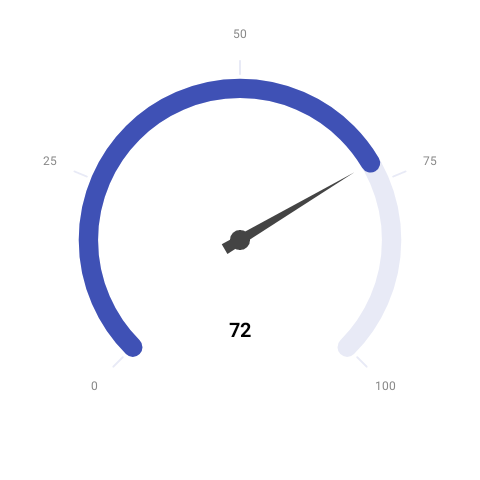
AngularGaugeChart( value = { 62f }, modifier = Modifier.size(300.dp), color = ChartyColor.Solid(Color(0xFF2962FF)), config = AngularGaugeConfig( minValue = 0f, maxValue = 100f, plotBands = listOf( GaugeBand(fromValue = 0f, toValue = 60f, color = ChartyColor.Solid(Color(0xFF43A047))), GaugeBand(fromValue = 60f, toValue = 85f, color = ChartyColor.Solid(Color(0xFFF9A825))), GaugeBand(fromValue = 85f, toValue = 100f, color = ChartyColor.Solid(Color(0xFFE53935))), ), ),)The chart draws, in order: the background track arc, the coloured plot bands, the major ticks and their labels, the progress arc (painted with the chart-level color), the tapered needle, and the value label below the pivot. value is clamped into [minValue, maxValue], so an out-of-range reading pins the needle at the end of the dial rather than overshooting it.
Plot bands#
Each GaugeBand paints a qualitative zone on the track. Bands must lie inside the configured range — AngularGaugeConfig throws if fromValue < minValue or toValue > maxValue, and GaugeBand itself requires toValue > fromValue.
config = AngularGaugeConfig( minValue = 0f, maxValue = 200f, plotBands = listOf( GaugeBand(fromValue = 0f, toValue = 120f, color = ChartyColor.Solid(Color(0xFF43A047))), GaugeBand(fromValue = 120f, toValue = 200f, color = ChartyColor.Gradient(listOf(Color(0xFFF9A825), Color(0xFFE53935)))), ),)Dial geometry#
startAngleDegrees is where the minimum value sits and sweepAngleDegrees is how far the dial travels clockwise from there. The defaults (135f / 270f) produce the classic three-quarter speedometer; a half-circle gauge is startAngleDegrees = 180f, sweepAngleDegrees = 180f.
config = AngularGaugeConfig( startAngleDegrees = 180f, sweepAngleDegrees = 180f, tickCount = 3, trackWidthFraction = 0.18f,)Value label and ticks#
config = AngularGaugeConfig( maxValue = 1f, tickCount = 6, tickLabelFormatter = { value -> "${(value * 100).toInt()}%" }, valueFormatter = { value -> "${(value * 100).toInt()}%" }, valueTextStyle = TextStyle(fontSize = 24.sp, fontWeight = FontWeight.Bold),)Animation#
The needle animates from minValue to the current value using the shared Animation configuration, and re-animates whenever the value changes. Animation.Disabled snaps the needle straight to the value.
config = AngularGaugeConfig(animation = Animation.Fast)Accessibility#
The gauge attaches an auto-generated screen-reader summary describing the value and its range. Override it with accessibilityDescription, or pass an empty string to suppress it when the same number is already announced next to the dial.
AngularGaugeChart( value = { 62f }, modifier = Modifier.size(300.dp), accessibilityDescription = "Server load 62 out of 100, in the warning band",)AngularGaugeConfig#
| Property | Type | Default | Description |
|---|---|---|---|
minValue | Float | 0f | Value at the start of the dial |
maxValue | Float | 100f | Value at the end of the dial; must be greater than minValue |
startAngleDegrees | Float | 135f | Dial angle for minValue |
sweepAngleDegrees | Float | 270f | Total travel of the dial; must be in (0f, 360f] |
tickCount | Int | 5 | Number of major ticks, including both ends; must be at least 2 |
tickLabelFormatter | (Float) -> String | rounds to the nearest whole number | Formats each tick label |
plotBands | List<GaugeBand> | emptyList() | Coloured zones on the track |
needleColor | ChartyColor | ChartyColor.Solid(Color.DarkGray) | Fill of the needle |
trackColor | ChartyColor | ChartyColor.Solid(Color.LightGray) | Fill of the background track arc |
trackWidthFraction | Float | 0.12f | Track thickness as a fraction of the dial radius; must be in (0f, 1f) |
showValueLabel | Boolean | true | Draws the formatted value below the pivot |
valueFormatter | (Float) -> String | rounds to the nearest whole number | Formats the value label |
animation | Animation | Animation.Default | Needle animation |
tickLabelTextStyle | TextStyle | 12 sp, gray | Style of the tick labels |
valueTextStyle | TextStyle | 20 sp, bold, black | Style of the value label |
GaugeBand(fromValue: Float, toValue: Float, color: ChartyColor).
Limitations#
- The gauge is not a Cartesian chart: it has no
visibleWindow, nomarkers, noanimateValueChanges, and no axis scaffold. - There is no click callback, no tooltip slot, and no crosshair — it renders a single read-only value.