RadarChart#
Best for displaying a single entity's performance across multiple axes (spider chart / star chart).
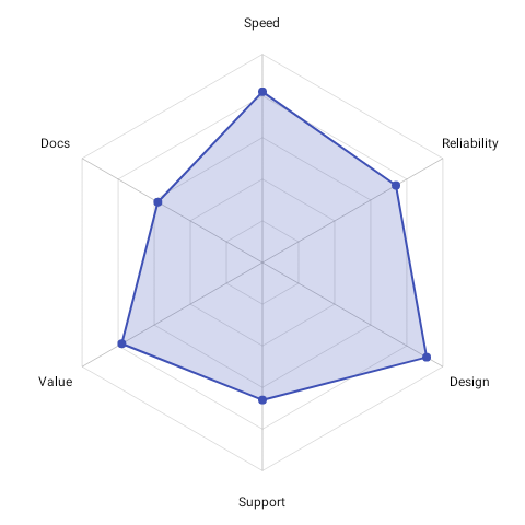
RadarChart( data = { listOf( RadarDataSet( label = "Team Alpha", axes = listOf( RadarAxisData(label = "Attack", value = 85f), RadarAxisData(label = "Defense", value = 70f), RadarAxisData(label = "Speed", value = 90f), RadarAxisData(label = "Stamina", value = 65f), RadarAxisData(label = "Skill", value = 80f), ), color = ChartyColor.Solid(Color(0xFF6650A4)), ), ) }, modifier = Modifier.size(300.dp), config = RadarChartConfig(animation = Animation.Default), onAxisClick = { axis, index -> println("Tapped ${axis.label} (index $index)") }, accessibilityDescription = "Team Alpha radar chart showing performance across five metrics",)RadarDataSet.color is required — there is no automatic palette assignment. RadarDataSet also requires a non-blank label and at least three axes; fewer throws at construction. fillAlpha (default 0.3f) controls how solid the polygon fill is.
Normalization#
Each RadarAxisData normalizes itself as value / maxValue, clamped to 0f..1f. maxValue defaults to 100f per axis — it is not derived from the other axes or from the data set. Give an axis its own maxValue when it uses a different scale:
axes = listOf( RadarAxisData(label = "Accuracy", value = 0.92f, maxValue = 1f), RadarAxisData(label = "Volume", value = 4200f, maxValue = 5000f),)value must be non-negative and maxValue positive.
Grid#
config = RadarChartConfig( gridConfig = RadarGridConfig( gridStyle = RadarGridStyle.CIRCULAR, numberOfGridLevels = 4, gridLineColor = ChartyColor.Solid(Color(0xFFBDBDBD)), axisLineColor = ChartyColor.Solid(Color(0xFF9E9E9E)), ),)Labels#
config = RadarChartConfig( labelConfig = RadarLabelConfig( showLabels = true, showValues = true, labelDistanceMultiplier = 1.2f, ),)Accessibility#
The chart attaches a generated summary ("Radar chart, 1 dataset, 5 axes each. Strongest axis: Speed (80%)."). Override it with accessibilityDescription, or pass an empty string to suppress it.
RadarChartConfig#
| Property | Type | Default | Description |
|---|---|---|---|
dataLineWidth | Float | 2f | Polygon outline width; must be positive |
showDataPoints | Boolean | true | Draws a dot at each axis vertex |
dataPointRadius | Float | 4f | Radius of those dots; non-negative |
strokeCap | StrokeCap | StrokeCap.Round | Cap of the polygon outline |
strokeJoin | StrokeJoin | StrokeJoin.Round | Join of the polygon outline |
startAngleDegrees | Float | -90f | Angle of the first axis (12 o'clock) |
labelConfig | RadarLabelConfig | RadarLabelConfig() | Axis label and value display |
gridConfig | RadarGridConfig | RadarGridConfig() | Grid and axis lines |
centerConfig | RadarCenterConfig | RadarCenterConfig() | Optional centre icon and backdrop |
animation | Animation | Animation.Default | Grow-from-centre entry animation |
scaleToFit | Boolean | true | Shrinks the radar just enough that labels (and value stacks) stay inside the canvas; floored at 40% of the padded radius so a pathological label cannot shrink the chart to a dot |
paddingFraction | Float | 0.15f | Padding around the radar; 0f..0.5f |
RadarLabelConfig#
| Property | Type | Default | Description |
|---|---|---|---|
showLabels | Boolean | true | Axis names, placed outside the grid |
showValues | Boolean | false | Each axis's value, styled by valueTextStyle, placed by valuePlacement |
valuePlacement | RadarValuePlacement | DATA_POINT | DATA_POINT or BELOW_AXIS_LABEL |
valueGapFraction | Float | 0.25f | Gap between a label and the value beneath it, as a fraction of the value's line height; non-negative |
labelDistanceMultiplier | Float | 1.15f | How far out the axis names sit; must be positive |
labelTextStyle | TextStyle | 12 sp, black | Style for the axis names |
valueTextStyle | TextStyle | 10 sp, black | Style for the values |
With RadarValuePlacement.DATA_POINT (the default) values follow the data points, so they stay
attached to what they report while the entry animation grows the shape. Their distance from each
point is derived from the point radius and the text's own size, so raising valueTextStyle's font
size keeps the same clearance instead of overlapping the shape.
RadarValuePlacement.BELOW_AXIS_LABEL centres each value beneath its axis name instead, outside the
plot. Prefer it when the values are part of the labelling — a dashboard listing this week's numbers —
or when many values sit at or near zero: a zero's vertex is the centre of the chart, so at
DATA_POINT every zero stacks onto the same point, while under the labels each one reads beside its
own axis.
config = RadarChartConfig( labelConfig = RadarLabelConfig( showValues = true, valuePlacement = RadarValuePlacement.BELOW_AXIS_LABEL, valueTextStyle = TextStyle(color = Color(0xFFCE3DF3), fontSize = 12.sp), ),)RadarGridConfig#
| Property | Type | Default |
|---|---|---|
gridStyle | RadarGridStyle | POLYGON (or CIRCULAR) |
numberOfGridLevels | Int | 5 (must be positive) |
showGridLines | Boolean | true |
showAxisLines | Boolean | true |
gridLineWidth | Float | 1f (must be positive) |
axisLineWidth | Float | 1f (must be positive) |
gridLineColor | ChartyColor | Solid(#BDBDBD at 50% alpha) |
axisLineColor | ChartyColor | Solid(#9E9E9E at 60% alpha) |
gridLineAlpha | Float | 0.5f (0f..1f) |
RadarCenterConfig#
| Property | Type | Default |
|---|---|---|
showCenterIcon | Boolean | false |
centerIconSize | Float | 40f (must be positive) |
centerBackgroundColor | ChartyColor | ChartyColor.Solid(Color.Transparent) |
centerBackgroundRadius | Float | 0f (non-negative) |
Limitations#
- Not a Cartesian chart: no
visibleWindow, nomarkers, noanimateValueChanges, no crosshair, no tooltip slot. - For several overlaid data sets with a legend, use MultipleRadarChart.