ComboChart#
Best for overlaying a bar series and a line series on the same axes — sales volume with a moving-average line, requests with a latency trend.
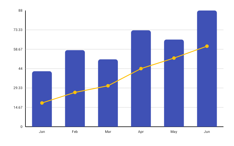
ComboChart( data = { listOf( ComboChartData(label = "Jan", barValue = 120f, lineValue = 105f), ComboChartData(label = "Feb", barValue = 95f, lineValue = 115f), ComboChartData(label = "Mar", barValue = 180f, lineValue = 130f), ComboChartData(label = "Apr", barValue = 140f, lineValue = 145f), ComboChartData(label = "May", barValue = 220f, lineValue = 160f), ) }, modifier = Modifier.fillMaxWidth().height(320.dp), barColor = ChartyColor.Solid(Color(0xFF6650A4)), lineColor = ChartyColor.Solid(Color(0xFFE91E63)), comboConfig = ComboChartConfig( barWidthFraction = 0.5f, barCornerRadius = CornerRadius.Medium, lineWidth = 2f, showPoints = true, animation = Animation.Default, ), onDataClick = { comboData -> println("${comboData.label}: bar=${comboData.barValue}, line=${comboData.lineValue}") },)Secondary axis#
When the two series live on different scales, give the line its own axis:
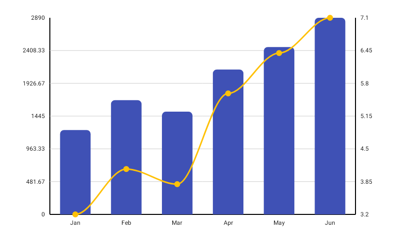
comboConfig = ComboChartConfig(secondaryAxisForLine = true)The bars keep the primary (left) axis and the line is scaled against its own range.
Corner radius#
comboConfig = ComboChartConfig(barCornerRadius = CornerRadius.Custom(radius = 10f))Rolling window#
comboConfig = ComboChartConfig(visibleWindow = 24, animation = Animation.Fast)Keeps only the last N points on screen and slides as data is appended; null or at least 2.
Persistent markers#
Markers anchor to the line's points.
comboConfig = ComboChartConfig( visibleWindow = 24, markers = listOf(PersistentMarker(dataIndex = -1, label = "Now")),)A negative dataIndex counts back from the end of the drawn data, so -1 marks the newest point.
Animating value changes#
comboConfig = ComboChartConfig(animateValueChanges = true, animation = Animation.Fast)Both the bar heights and the line points tween to their new values.
Crosshair#
ComboChart( data = { series }, modifier = Modifier.fillMaxWidth().height(320.dp), barColor = ChartyColor.Solid(Color(0xFF6650A4)), lineColor = ChartyColor.Solid(Color(0xFFE91E63)), crosshair = ChartCrosshair(config = ChartCrosshairConfig(dismissOnRelease = true)),)The crosshair snaps to the line points. comboConfig.crosshairConfig is the older equivalent; the crosshair parameter wins when both are set.
Tooltip#
ComboChart has no tooltip parameter — tapping raises the built-in canvas tooltip only, styled and formatted through the config.
comboConfig = ComboChartConfig( tooltipConfig = TooltipConfig(showArrow = false), tooltipPosition = TooltipPosition.ABOVE, tooltipFormatter = { data -> "${data.label}: ${data.barValue} / ${data.lineValue}" },)Accessibility#
A generated combo summary ("Combo chart, 5 data points. Highest bar: … Highest line: …") plus one focusable node per point.
interactionConfig = ChartInteractionConfig(accessibilityDescription = "Orders with average basket size")ComboChartConfig#
| Property | Type | Default | Description |
|---|---|---|---|
barWidthFraction | Float | 0.6f | Bar width as a fraction of its slot; 0f..1f |
barCornerRadius | CornerRadius | CornerRadius.Medium | Bar corner rounding |
lineWidth | Float | 3f | Line stroke width; must be greater than 0 |
showPoints | Boolean | true | Draws a dot at each line point |
pointRadius | Float | 6f | Radius of those dots; must be greater than 0 |
pointAlpha | Float | 1f | Dot opacity, 0f..1f |
strokeCap | StrokeCap | StrokeCap.Round | Cap of the line stroke |
smoothCurve | Boolean | false | Cubic-bezier curve instead of straight segments |
negativeValuesDrawMode | NegativeValuesDrawMode | BELOW_AXIS | BELOW_AXIS or FROM_MIN_VALUE |
animation | Animation | Animation.Default | Entry animation |
animateValueChanges | Boolean | false | Tween values on data change |
referenceLine | ReferenceLineConfig? | null | Optional horizontal guide line |
referenceBand | ReferenceBandConfig? | null | Optional shaded value band |
markers | List<PersistentMarker> | emptyList() | Persistent pinned labels on the line |
secondaryAxisForLine | Boolean | false | Scales the line against its own axis |
tooltipConfig | TooltipConfig? | null (the theme's) | Canvas tooltip appearance |
tooltipPosition | TooltipPosition | AUTO | ABOVE, BELOW, or AUTO |
tooltipFormatter | (ComboChartData) -> String | "label: Bar=…, Line=…" | Tooltip text |
crosshairConfig | ChartCrosshairConfig? | null | Legacy crosshair switch; crosshair takes precedence |
visibleWindow | Int? | null | Rolling "show last N" window; null or >= 2 |
Limitations#
- No
LineInterpolationhere — the line offers onlysmoothCurveon/off, unlike LineChart.