BarChart#
Best for comparing discrete values across categories with vertical bars.
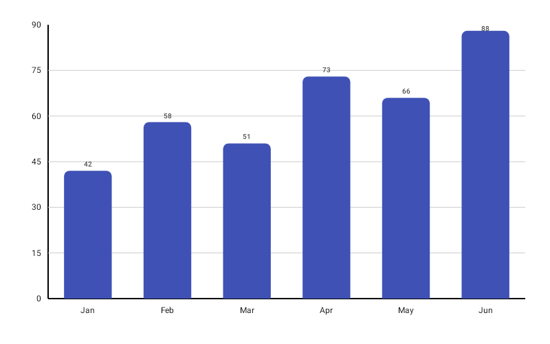
BarChart( data = { listOf( BarData(label = "Mon", value = 120f), BarData(label = "Tue", value = 85f), BarData(label = "Wed", value = 200f), BarData(label = "Thu", value = 60f), BarData(label = "Fri", value = 175f), ) }, modifier = Modifier.fillMaxWidth().height(300.dp), color = ChartyColor.Solid(Color(0xFF6650A4)), barConfig = BarChartConfig( cornerRadius = CornerRadius.Large, showDataLabels = true, animation = Animation.Default, ), onBarClick = { barData -> println("Clicked: ${barData.label} = ${barData.value}") },)A BarData may carry its own color: ChartyColor?, which overrides the chart-level color for that bar.
Corner radius#
cornerRadius is a sealed class with presets and a custom option:
barConfig = BarChartConfig(cornerRadius = CornerRadius.Custom(radius = 20f))None (0), Small (4), Medium (8, the default), Large (12), ExtraLarge (16), or Custom(radius) for any non-negative value.
Data labels#
barConfig = BarChartConfig( showDataLabels = true, dataLabelFormatter = { barData -> "${barData.value.toInt()}k" }, dataLabelStyle = TextStyle(fontSize = 11.sp, fontWeight = FontWeight.SemiBold),)Rolling window#
visibleWindow keeps only the last N bars on screen; as data is appended the window slides.
BarChart( data = { throughput }, modifier = Modifier.fillMaxWidth().height(300.dp), color = ChartyColor.Solid(Color(0xFF6650A4)), barConfig = BarChartConfig(visibleWindow = 30, animation = Animation.Fast),)It must be null (disabled) or at least 2.
Persistent markers#
markers pins a permanent dot and callout to the top of a bar. A negative dataIndex counts back from the end of the drawn data, so dataIndex = -1 labels the newest bar — the idiom for keeping a label on the latest value of a rolling window.
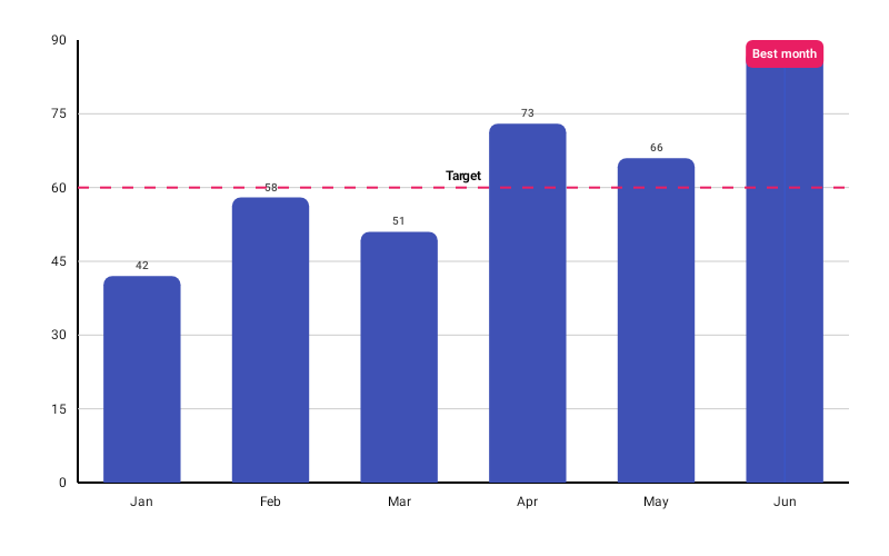
BarChart( data = { throughput }, modifier = Modifier.fillMaxWidth().height(300.dp), color = ChartyColor.Solid(Color(0xFF6650A4)), barConfig = BarChartConfig( visibleWindow = 30, markers = listOf(PersistentMarker(dataIndex = -1, label = "Now")), ),)With no label the marker shows the bar's formatted value; markers outside the drawn range are skipped.
Animating value changes#
barConfig = BarChartConfig(animateValueChanges = true, animation = Animation.Fast)Bars glide to their new heights when the data changes instead of jumping.
Crosshair#
BarChart gained a crosshair recently: a vertical guide that snaps to the nearest bar's centre as you drag. It leaves taps alone, so tapping a bar still raises its tooltip and calls onBarClick.
BarChart( data = { series }, modifier = Modifier.fillMaxWidth().height(300.dp), color = ChartyColor.Solid(Color(0xFF6650A4)), crosshair = ChartCrosshair(config = ChartCrosshairConfig(showHorizontalLine = false)),)barConfig.crosshairConfig is the older equivalent; the crosshair parameter wins when both are set. Streaming scrollback does not survive a crosshair — the crosshair owns the drag.
Tooltip#
BarChart( data = { series }, modifier = Modifier.fillMaxWidth().height(300.dp), color = ChartyColor.Solid(Color(0xFF6650A4)), tooltip = ChartTooltip.canvas(), barConfig = BarChartConfig( tooltipFormatter = { barData -> "${barData.label}: ${barData.value}" }, tooltipPosition = TooltipPosition.ABOVE, ),)ChartTooltip.canvas() (default) draws the built-in bubble; ChartTooltip.compose { … } renders any composable over the selected bar; ChartTooltip.none() disables it.
Set ChartInteractionConfig(dragTooltipEnabled = true) to track the bar under the finger while dragging.
Accessibility#
The chart attaches a generated summary ("Bar chart, 5 bars. Range: … Highest: … Lowest: …") plus one focusable node per bar, so screen readers can traverse the bars one by one.
BarChart( data = { series }, modifier = Modifier.fillMaxWidth().height(300.dp), color = ChartyColor.Solid(Color(0xFF6650A4)), interactionConfig = ChartInteractionConfig(accessibilityDescription = "Daily orders, Monday to Friday"),)Pass an empty string to suppress the summary.
BarChartConfig#
Shared with HorizontalBarChart and SpanChart.
| Property | Type | Default | Description |
|---|---|---|---|
barWidthFraction | Float | 0.6f | Bar width as a fraction of its slot; must be in 0f..1f |
barSpacing | Float | 0f | Extra gap between bars; must be non-negative |
cornerRadius | CornerRadius | CornerRadius.Medium | Rounding of the bar's value end |
negativeValuesDrawMode | NegativeValuesDrawMode | BELOW_AXIS | BELOW_AXIS (bars extend past zero) or FROM_MIN_VALUE (baseline shifts to the minimum) |
animation | Animation | Animation.Default | Grow-from-baseline entry animation |
animateValueChanges | Boolean | false | Tween bar values on data change |
referenceLine | ReferenceLineConfig? | null | Optional guide line |
referenceBand | ReferenceBandConfig? | null | Optional shaded band (vertical BarChart only) |
markers | List<PersistentMarker> | emptyList() | Persistent pinned labels |
tooltipConfig | TooltipConfig? | null (the theme's) | Canvas tooltip appearance |
tooltipPosition | TooltipPosition | AUTO | ABOVE, BELOW, or AUTO |
tooltipFormatter | (BarData) -> String | "label: value" | Tooltip text |
crosshairConfig | ChartCrosshairConfig? | null | Legacy crosshair switch; crosshair takes precedence |
showDataLabels | Boolean | false | Draws the value at the bar's end |
dataLabelFormatter | (BarData) -> String | whole numbers unformatted | Data label text |
dataLabelStyle | TextStyle | 10 sp, semi-bold, dark gray | Data label style |
visibleWindow | Int? | null | Rolling "show last N" window; null or >= 2 |