GroupedHorizontalBarChart#
Best for side-by-side comparison of multiple series across the same categories in a horizontal layout.
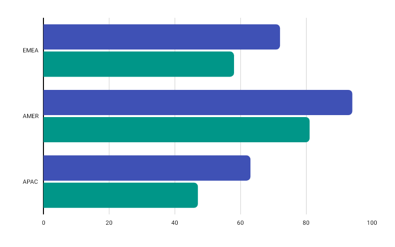
Kotlin
GroupedHorizontalBarChart( data = { listOf( BarGroup(label = "Region A", values = listOf(120f, -40f, 80f)), BarGroup(label = "Region B", values = listOf(90f, 60f, -30f)), ) }, modifier = Modifier.fillMaxWidth().height(300.dp), colors = ChartyColor.Gradient(listOf(Color(0xFF6650A4), Color(0xFF03DAC5))), config = GroupedHorizontalBarChartConfig( barWidthFraction = 0.7f, barSpacing = 4f, cornerRadius = CornerRadius.Medium, negativeValuesDrawMode = NegativeValuesDrawMode.BELOW_AXIS, animation = Animation.Default, ), onBarClick = { entry -> println("Group ${entry.barGroup.label}, bar ${entry.barIndex} = ${entry.barValue}") },)The chart-level colors defaults to ChartyColors.ModernPalette. A BarGroup may supply its own colors list, which must have one entry per value.
Click data: GroupedHorizontalBarEntry(barGroup, barIndex, barValue)
Corner radius#
Kotlin
config = GroupedHorizontalBarChartConfig(cornerRadius = CornerRadius.Custom(radius = 6f))Applies to the trailing end of each individual bar.
Rolling window#
Kotlin
config = GroupedHorizontalBarChartConfig(visibleWindow = 8, animation = Animation.Fast)Keeps only the last N groups on screen; null or at least 2.
Persistent markers#
Kotlin
config = GroupedHorizontalBarChartConfig( visibleWindow = 8, markers = listOf(PersistentMarker(dataIndex = -1, label = "Latest")),)A negative dataIndex counts back from the end of the drawn data, so -1 marks the newest group.
Animating value changes#
Kotlin
config = GroupedHorizontalBarChartConfig(animateValueChanges = true, animation = Animation.Fast)Tooltip#
Kotlin
GroupedHorizontalBarChart( data = { groups }, modifier = Modifier.fillMaxWidth().height(300.dp), colors = ChartyColors.ModernPalette, tooltip = ChartTooltip.canvas(), config = GroupedHorizontalBarChartConfig( tooltipFormatter = { entry -> "${entry.barGroup.label}: ${entry.barValue}" }, ),)Accessibility#
A generated summary plus one focusable node per group, laid out top-to-bottom. Each node announces the group's label and the sum of its values.
Kotlin
interactionConfig = ChartInteractionConfig(accessibilityDescription = "Regional performance by metric")GroupedHorizontalBarChartConfig#
| Property | Type | Default | Description |
|---|---|---|---|
barWidthFraction | Float | 0.8f | Group thickness as a fraction of its slot; 0f..1f |
barSpacing | Float | 4f | Gap between bars inside a group; non-negative |
cornerRadius | CornerRadius | CornerRadius.Medium | Rounds the trailing end of each bar |
negativeValuesDrawMode | NegativeValuesDrawMode | BELOW_AXIS | Negative bars extend left of the axis; positive bars right |
animation | Animation | Animation.Default | Grow-from-baseline entry animation |
animateValueChanges | Boolean | false | Tween bar values on data change |
referenceLine | ReferenceLineConfig? | null | Optional vertical guide line |
markers | List<PersistentMarker> | emptyList() | Persistent pinned labels |
tooltipConfig | TooltipConfig? | null (the theme's) | Canvas tooltip appearance |
tooltipPosition | TooltipPosition | AUTO | ABOVE, BELOW, or AUTO |
tooltipFormatter | (GroupedHorizontalBarEntry) -> String | "label[i]: value" | Tooltip text |
visibleWindow | Int? | null | Rolling "show last N" window; null or >= 2 |
Limitations#
- No crosshair: there is no
crosshairparameter and nocrosshairConfigon this config.