BubbleBarChart#
Best for a playful alternative to a plain bar: instead of a solid rectangle, each column is filled with a stack of circles whose overall height still encodes the value.
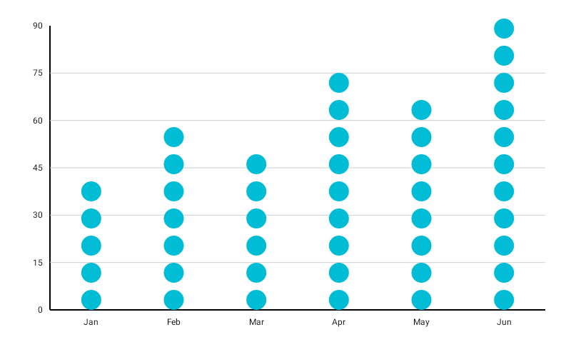
BubbleBarChart( data = { listOf( BarData(label = "Mon", value = 5f), BarData(label = "Tue", value = 8f), BarData(label = "Wed", value = 3f), BarData(label = "Thu", value = 10f), BarData(label = "Fri", value = 6f), ) }, modifier = Modifier.fillMaxWidth().height(320.dp), color = ChartyColor.Solid(ChartyColors.Blue), bubbleConfig = BubbleBarChartConfig( bubbleRadius = 40f, bubbleSpacing = 8f, animation = Animation.Default, ), onBarClick = { barData -> println("Clicked: ${barData.label} = ${barData.value}") },)The value maps to the column's height exactly as in a normal bar chart; the number of bubbles is then derived from that pixel height divided by bubbleRadius * 2 + bubbleSpacing. It is not a count of items, and there is no partial bubble — the topmost bubble is clipped to the column instead. A larger bubbleRadius means fewer, bigger bubbles for the same value.
A BarData may carry its own color: ChartyColor?, which overrides the chart-level color. A ChartyColor.Gradient is sampled per bubble, so the stack shades from one end of the gradient to the other.
Rolling window#
bubbleConfig = BubbleBarChartConfig(visibleWindow = 15, animation = Animation.Fast)Keeps only the last N columns on screen; null or at least 2.
Persistent markers#
bubbleConfig = BubbleBarChartConfig( visibleWindow = 15, markers = listOf(PersistentMarker(dataIndex = -1, label = "Now")),)A negative dataIndex counts back from the end of the drawn data, so -1 marks the newest column.
Animating value changes#
bubbleConfig = BubbleBarChartConfig(animateValueChanges = true, animation = Animation.Fast)Tooltip#
BubbleBarChart has no tooltip parameter — tapping a column raises the built-in canvas tooltip only, styled through the config.
bubbleConfig = BubbleBarChartConfig( tooltipConfig = TooltipConfig(showArrow = false), tooltipPosition = TooltipPosition.ABOVE, tooltipFormatter = { barData -> "${barData.label}: ${barData.value}" },)Accessibility#
A generated summary plus one focusable node per column.
interactionConfig = ChartInteractionConfig(accessibilityDescription = "Daily activity")BubbleBarChartConfig#
| Property | Type | Default | Description |
|---|---|---|---|
barWidthFraction | Float | 0.2f | Column width as a fraction of its slot; 0f..1f |
bubbleRadius | Float | 100f | Radius of each bubble in pixels; must be positive |
bubbleSpacing | Float | 8f | Vertical gap between bubbles; non-negative |
negativeValuesDrawMode | NegativeValuesDrawMode | BELOW_AXIS | BELOW_AXIS or FROM_MIN_VALUE |
animation | Animation | Animation.Default | Fill-from-baseline entry animation |
animateValueChanges | Boolean | false | Tween values on data change |
referenceLine | ReferenceLineConfig? | null | Optional horizontal guide line |
markers | List<PersistentMarker> | emptyList() | Persistent pinned labels |
tooltipConfig | TooltipConfig? | null (the theme's) | Canvas tooltip appearance |
tooltipPosition | TooltipPosition | AUTO | ABOVE, BELOW, or AUTO |
tooltipFormatter | (BarData) -> String | "label: value" | Tooltip text |
visibleWindow | Int? | null | Rolling "show last N" window; null or >= 2 |
The default bubbleRadius of 100f produces one very large bubble per column at typical chart heights; set it explicitly.
Limitations#
- No crosshair.
- No corner radius and no data labels.