StackedBarChart#
Best for showing part-to-whole relationships across categories with vertical stacked bars.
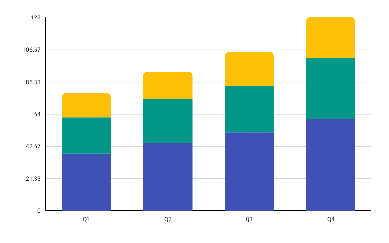
StackedBarChart( data = { listOf( BarGroup( label = "Q1", values = listOf(40f, 60f, 30f), colors = listOf( ChartyColor.Solid(Color(0xFF6650A4)), ChartyColor.Solid(Color(0xFF9C27B0)), ChartyColor.Solid(Color(0xFFCE93D8)), ), ), BarGroup(label = "Q2", values = listOf(55f, 45f, 70f)), BarGroup(label = "Q3", values = listOf(80f, 20f, 50f)), ) }, modifier = Modifier.fillMaxWidth().height(320.dp), colors = ChartyColor.Solid(Color(0xFF6650A4)), stackedConfig = StackedBarChartConfig( showDataLabels = true, topCornerRadius = CornerRadius.Medium, animation = Animation.Default, ), onSegmentClick = { segment -> println("Segment ${segment.segmentIndex} of ${segment.barGroup.label}") },)BarGroup.colors is optional. When present it must have exactly one ChartyColor per value — BarGroup throws at construction if the sizes differ. When absent, segments take their colour from the chart-level colors.
Click data: StackedBarSegment(barGroup, segmentIndex, segmentValue)
Corner radius#
topCornerRadius rounds the top corners of the topmost segment only:
stackedConfig = StackedBarChartConfig(topCornerRadius = CornerRadius.Custom(radius = 14f))Data labels#
stackedConfig = StackedBarChartConfig( showDataLabels = true, dataLabelFormatter = { group -> "${group.values.sum().toInt()}" },)The label is per stack, not per segment — the default formatter prints the sum of the group's values above the bar.
Rolling window#
StackedBarChart( data = { groups }, modifier = Modifier.fillMaxWidth().height(320.dp), colors = ChartyColors.DefaultGradient, stackedConfig = StackedBarChartConfig(visibleWindow = 20, animation = Animation.Fast),)Keeps only the last N stacks on screen; null or at least 2.
Persistent markers#
Markers anchor to the top of each stack. A negative dataIndex counts back from the end of the drawn data, so dataIndex = -1 marks the newest stack.
stackedConfig = StackedBarChartConfig( visibleWindow = 20, markers = listOf(PersistentMarker(dataIndex = -1, label = "Latest")),)Animating value changes#
stackedConfig = StackedBarChartConfig(animateValueChanges = true, animation = Animation.Fast)Tooltip#
StackedBarChart( data = { groups }, modifier = Modifier.fillMaxWidth().height(320.dp), colors = ChartyColors.DefaultGradient, tooltip = ChartTooltip.canvas(), stackedConfig = StackedBarChartConfig( tooltipFormatter = { segment -> "${segment.barGroup.label}: ${segment.segmentValue}" }, ),)ChartTooltip.compose { … } and ChartTooltip.none() are also available.
Accessibility#
A generated grouped/stacked summary plus one focusable node per stack.
interactionConfig = ChartInteractionConfig(accessibilityDescription = "Quarterly revenue by product line")StackedBarChartConfig#
| Property | Type | Default | Description |
|---|---|---|---|
barWidthFraction | Float | 0.6f | Stack width as a fraction of its slot; 0f..1f |
barSpacing | Float | 0f | Extra gap between stacks; non-negative |
topCornerRadius | CornerRadius | CornerRadius.Medium | Rounds the top of the topmost segment |
animation | Animation | Animation.Default | Grow-from-bottom entry animation |
animateValueChanges | Boolean | false | Tween segment values on data change |
referenceLine | ReferenceLineConfig? | null | Optional horizontal guide line |
markers | List<PersistentMarker> | emptyList() | Persistent pinned labels |
tooltipConfig | TooltipConfig? | null (the theme's) | Canvas tooltip appearance |
tooltipPosition | TooltipPosition | AUTO | ABOVE, BELOW, or AUTO |
tooltipFormatter | (StackedBarSegment) -> String | "label [i]: value" | Tooltip text |
showDataLabels | Boolean | false | Draws the stack total above each bar |
dataLabelFormatter | (BarGroup) -> String | sum of values | Data label text |
dataLabelStyle | TextStyle | 10 sp, semi-bold, dark gray | Data label style |
visibleWindow | Int? | null | Rolling "show last N" window; null or >= 2 |
Limitations#
- No crosshair:
StackedBarCharthas nocrosshairparameter andStackedBarChartConfighas nocrosshairConfig.