LineChart#
Best for visualizing a single data series over time or an ordered sequence of values.
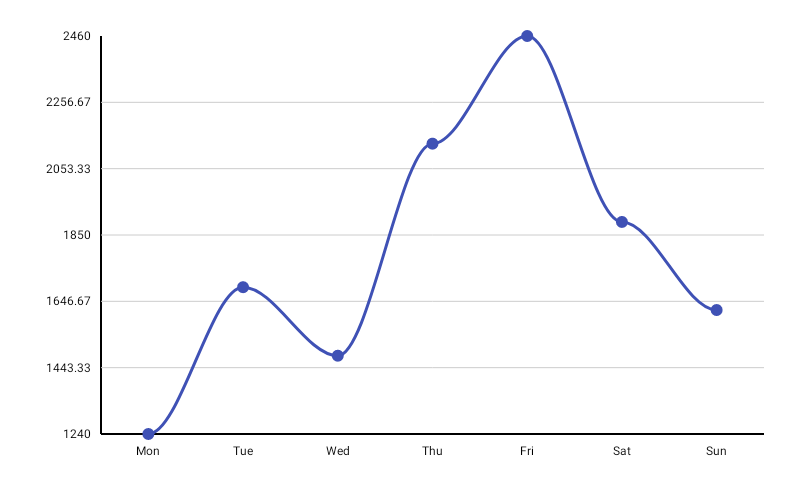
LineChart( data = { listOf( LineData(label = "Jan", value = 120f), LineData(label = "Feb", value = 95f), LineData(label = "Mar", value = 180f), LineData(label = "Apr", value = 140f), LineData(label = "May", value = 220f), LineData(label = "Jun", value = 175f), ) }, modifier = Modifier.fillMaxWidth().height(300.dp), color = ChartyColor.Solid(Color(0xFF6650A4)), lineConfig = LineChartConfig( lineWidth = 2f, showPoints = true, pointRadius = 4f, interpolation = LineInterpolation.SMOOTH, animation = Animation.Default, ), onPointClick = { lineData -> println("Clicked: ${lineData.label} = ${lineData.value}") },)Interpolation#
interpolation decides how consecutive points are connected:
LineInterpolation.LINEAR— straight segments (default)LineInterpolation.SMOOTH— a cubic-bezier curve through the pointsLineInterpolation.STEP— the value holds until the next x, then jumps
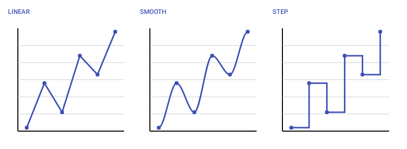
LineChart( data = { series }, modifier = Modifier.fillMaxWidth().height(300.dp), color = ChartyColor.Solid(Color(0xFF6650A4)), lineConfig = LineChartConfig(interpolation = LineInterpolation.STEP),)The older smoothCurve boolean still works, but only as a fallback: interpolation wins unless it is LINEAR, in which case smoothCurve = true draws a smooth curve. Prefer interpolation in new code.
Rolling window#
visibleWindow keeps only the last N points on screen. As you append data the window slides, so a chart fed from a stream shows a moving view instead of squeezing an ever-growing series into the same width.
LineChart( data = { readings }, modifier = Modifier.fillMaxWidth().height(300.dp), color = ChartyColor.Solid(Color(0xFF6650A4)), lineConfig = LineChartConfig(visibleWindow = 60, animation = Animation.Fast),)It must be null (disabled) or at least 2. Pair it with ChartInteractionConfig(streamingState = …) to let the reader drag back through history, and with jumpToLatest to offer a "back to now" control.
Persistent markers#
markers pins a permanent dot and callout to a data index — a peak, a target, "today". A negative dataIndex counts back from the end of the drawn data, so dataIndex = -1 labels the newest point. That is the main use, and it is what keeps a label attached to the latest value of a rolling visibleWindow.
LineChart( data = { readings }, modifier = Modifier.fillMaxWidth().height(300.dp), color = ChartyColor.Solid(Color(0xFF6650A4)), lineConfig = LineChartConfig( visibleWindow = 60, markers = listOf(PersistentMarker(dataIndex = -1)), ),)With no label the marker shows the point's formatted value. Markers whose index falls outside the drawn data are skipped.
lineConfig = LineChartConfig( markers = listOf( PersistentMarker(dataIndex = 3, label = "Peak", showGuideLine = true), PersistentMarker(dataIndex = -1, dotColor = ChartyColor.Solid(Color(0xFFE53935))), ),)Animating value changes#
animateValueChanges = true tweens each point toward its new position when the data changes, instead of the line jumping.
lineConfig = LineChartConfig(animateValueChanges = true, animation = Animation.Fast)Crosshair#
crosshair adds a draggable guide line that snaps to the nearest point. It is a drag gesture and leaves taps alone, so tap-to-tooltip and onPointClick keep working alongside it.
LineChart( data = { series }, modifier = Modifier.fillMaxWidth().height(300.dp), color = ChartyColor.Solid(Color(0xFF6650A4)), crosshair = ChartCrosshair( config = ChartCrosshairConfig( verticalLineColor = ChartyColor.Solid(Color(0xFF6650A4)), showHorizontalLine = false, dismissOnRelease = true, ), ),)Supply your own label composable when the built-in pill is not enough:
crosshair = ChartCrosshair( config = ChartCrosshairConfig(showHorizontalLine = false), label = { Text(text = "${data.label}: ${data.value}") },)LineChartConfig.crosshairConfig is the older way to switch the crosshair on and still works; the crosshair parameter takes precedence when both are set. Because the crosshair owns the horizontal drag, streaming scrollback is unavailable on a chart that has one.
Tooltip#
LineChart( data = { series }, modifier = Modifier.fillMaxWidth().height(300.dp), color = ChartyColor.Solid(Color(0xFF6650A4)), tooltip = ChartTooltip.canvas(), lineConfig = LineChartConfig( tooltipFormatter = { lineData -> "${lineData.label}: ${lineData.value}" }, ),)ChartTooltip.canvas() (the default) draws the built-in bubble on the canvas, styled by lineConfig.tooltipConfig. ChartTooltip.compose { … } renders any composable positioned over the selected point. ChartTooltip.none() disables it.
Accessibility#
The chart attaches a generated summary ("Line chart, 12 data points. Range: … Peak: … Lowest: …") plus one focusable node per data point, so screen readers can traverse the series point by point. Override the summary through interactionConfig:
LineChart( data = { series }, modifier = Modifier.fillMaxWidth().height(300.dp), color = ChartyColor.Solid(Color(0xFF6650A4)), interactionConfig = ChartInteractionConfig(accessibilityDescription = "Monthly revenue trend"),)Pass an empty string to suppress the summary.
LineChartConfig#
Shared by LineChart, AreaChart, MultilineChart, and StackedAreaChart — not every property is honoured by all four; see each chart's page.
| Property | Type | Default | Description |
|---|---|---|---|
lineWidth | Float | 3f | Stroke width in pixels; must be greater than 0 |
showPoints | Boolean | true | Draws a dot at each data point |
pointRadius | Float | 6f | Radius of those dots; must be greater than 0 |
pointAlpha | Float | 1f | Opacity of the dots, 0f..1f |
strokeCap | StrokeCap | StrokeCap.Round | Cap of the line stroke |
smoothCurve | Boolean | false | Legacy smooth-curve flag; only consulted when interpolation is LINEAR |
interpolation | LineInterpolation | LINEAR | LINEAR, SMOOTH, or STEP |
negativeValuesDrawMode | NegativeValuesDrawMode | BELOW_AXIS | BELOW_AXIS or FROM_MIN_VALUE |
animation | Animation | Animation.Default | Entry animation (800 ms tween) |
animateValueChanges | Boolean | false | Tween values to new positions on data change |
referenceLine | ReferenceLineConfig? | null | Optional horizontal guide line |
referenceBand | ReferenceBandConfig? | null | Optional shaded value band |
markers | List<PersistentMarker> | emptyList() | Persistent pinned labels |
tooltipConfig | TooltipConfig? | null (the theme's) | Canvas tooltip appearance |
tooltipPosition | TooltipPosition | AUTO | ABOVE, BELOW, or AUTO |
tooltipFormatter | (LineData) -> String | "label: value" | Tooltip text |
crosshairConfig | ChartCrosshairConfig? | null | Legacy crosshair switch; crosshair takes precedence |
highlightSelectedColumn | Boolean | false | Shades the column of the selected point |
selectionColumnColor | ChartyColor | Solid(#142962FF) | Colour of that shading |
selectionColumnWidth | Float? | null | Fixed width for the shading; null derives it from spacing |
legendLabels | List<String> | emptyList() | Legend entries (multi-series charts) |
legendTextStyle | TextStyle | 12 sp | Legend text style |
showGradientFill | Boolean | false | Shaded area under each series (multi-series charts) |
gradientFillAlpha | Float | 0.3f | Opacity of that shading, 0f..1f |
fillAlpha | Float | 0.3f | Opacity of the AreaChart fill, 0f..1f |
downsampleThreshold | Int? | null | Max points to render (LTTB); null or >= 3 |
visibleWindow | Int? | null | Rolling "show last N" window; null or >= 2 |