Sparkline#
Best for an inline trend inside something else — a table row, a list item, a dashboard tile, a card header. It plots a plain List<Float> across the whole area you give it, with no chrome of any kind.
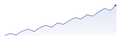
Sparkline( data = { listOf(12f, 15f, 11f, 18f, 22f, 19f, 26f) }, modifier = Modifier.width(120.dp).height(32.dp), color = ChartyColor.Solid(Color(0xFF2962FF)),)Note the data type: Sparkline takes raw Float values, not LineData. There are no labels because there is nowhere to draw them.
No axes, labels, tooltip, or interaction — by design#
A sparkline is deliberately the one chart in Charty with no scaffold and no gestures:
- No axes, grid, or labels. The line is normalised to fill the entire draw area — the maximum value touches the top edge, the minimum touches the bottom. There is no padding, so it lines up flush with adjacent text.
- No tooltip, crosshair, or click callback. It is meant to sit inside a row or cell that already owns the touch target; adding a second gesture consumer there would fight with the surrounding list.
- No
visibleWindow,markers, oranimateValueChanges. Those belong to the Cartesian charts built onChartScaffold;Sparklinedraws straight onto aCanvas.
The consequence worth remembering: because every sparkline normalises to its own min and max, two sparklines are not comparable to each other. A flat-looking series and a dramatic one may span very different value ranges. Print the actual number next to it.
When you need axes, a tooltip, or interaction, use LineChart or AreaChart instead.
Edge cases#
- An empty list draws nothing.
- A single value draws a flat line at mid-height across the full width.
- A series where every value is equal also draws a centred flat line, rather than pinning to the top or bottom.
Fill and last-point dot#
Sparkline( data = { revenueByDay }, modifier = Modifier.width(160.dp).height(40.dp), color = ChartyColor.Gradient(listOf(Color(0xFF43A047), Color(0xFF1B5E20))), config = SparklineConfig( lineWidth = 2f, showFill = true, fillAlpha = 0.2f, showLastPointDot = true, lastPointDotRadius = 4f, ),)A ChartyColor.Gradient paints the stroke, the fill, and the dot.
Smooth curve#
Sparkline( data = { cpuLoad }, modifier = Modifier.width(120.dp).height(32.dp), config = SparklineConfig(smoothCurve = true),)smoothCurve = true connects the values with a cubic-bezier curve; false (the default) uses straight segments. There is no LineInterpolation parameter — a sparkline offers only these two.
Animation#
Animation is off by default here, unlike every other chart, because a sparkline usually appears inside a scrolling list where a reveal on every bind is noise. Turn it on explicitly when the sparkline is a focal element:
Sparkline( data = { weeklyOrders }, modifier = Modifier.width(120.dp).height(32.dp), config = SparklineConfig(animation = Animation.Fast),)The entry animation clips the line and fill from the left and fades the last-point dot in.
Accessibility#
By default the sparkline attaches a generated summary — value count, first and last value, and the range. Pass an empty string to suppress it, which is usually right when the sparkline sits next to a number that already says the same thing.
Sparkline( data = { weeklyOrders }, modifier = Modifier.width(120.dp).height(32.dp), accessibilityDescription = "",)There is no per-point screen-reader traversal — the chart has no data points to traverse in the semantics tree.
SparklineConfig#
| Property | Type | Default | Description |
|---|---|---|---|
lineWidth | Float | 1.5f | Stroke width in pixels; must be greater than 0f |
showFill | Boolean | true | Fills the area under the line down to the bottom edge |
fillAlpha | Float | 0.15f | Opacity of the fill; must be in 0f..1f |
showLastPointDot | Boolean | true | Draws a dot on the most recent value |
lastPointDotRadius | Float | 3f | Radius of that dot in pixels; must be greater than 0f |
smoothCurve | Boolean | false | Cubic-bezier curve instead of straight segments |
animation | Animation | Animation.Disabled | Left-to-right reveal; disabled by default |