CalendarHeatmapChart#
Best for visualizing daily activity or intensity over weeks and months in a calendar grid, like GitHub's contribution graph. For a grid that is not tied to dates, see MatrixHeatmapChart.
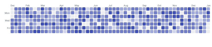
CalendarHeatmapChart( data = { listOf( CalendarData(year = 2024, month = 1, day = 1, value = 3f), CalendarData(year = 2024, month = 1, day = 2, value = 7f), CalendarData(year = 2024, month = 1, day = 3, value = 0f), CalendarData(year = 2024, month = 1, day = 4, value = 12f), CalendarData(year = 2024, month = 1, day = 7, value = 5f), ) }, modifier = Modifier.fillMaxWidth(), config = CalendarHeatmapConfig(animation = Animation.Default), visibleWeeks = 12, scrollEnabled = true, onDayClick = { data -> println("${data.year}-${data.month}-${data.day}: ${data.value}") },)CalendarData validates month in 1..12 and day in 1..31 at construction. Data points need not be contiguous — missing dates render as empty cells.
visibleWeeks is nullable (Int?, default null): leave it out to fit the whole range, or set it to cap how many week columns are on screen at once. scrollEnabled (default true) allows horizontal scrolling through the full date range.
Cell appearance#
config = CalendarHeatmapConfig( cellShape = CellShape.Circle, cellSize = 16.dp, cellSpacing = 3.dp,)CellShape is a sealed class: Square, RoundedSquare(cornerRadius), Circle, or Diamond.
Intensity colours#
config = CalendarHeatmapConfig( intensityColors = listOf( Color(0xFFD7CCF7), Color(0xFFB39DDB), Color(0xFF7E57C2), Color(0xFF4527A0), ), emptyColor = Color(0xFFF0F0F0),)Values are interpolated across intensityColors from lowest to highest; days with no data use emptyColor. The list must not be empty. Note these are plain Color values, not ChartyColor.
Labels and week start#
config = CalendarHeatmapConfig( showMonthLabels = true, showDayLabels = true, weekStartDay = WeekStartDay.MONDAY, labelTextStyle = TextStyle(fontSize = 11.sp),)Tooltip#
Tapping a day with data raises the built-in canvas tooltip. There is no tooltip parameter on this chart, so the canvas bubble is the only option; style and format it through the config.
config = CalendarHeatmapConfig( tooltipConfig = TooltipConfig(showArrow = false), tooltipFormatter = { data -> "${data.value.toInt()} commits on ${data.month}/${data.day}" },)Accessibility#
The chart attaches a generated summary to its root: "Calendar heatmap, N days with data. Busiest day: …". Unlike most charts there is no way to override or suppress it — CalendarHeatmapChart has no accessibilityDescription parameter and no interactionConfig. There is also no per-day screen-reader traversal.
CalendarHeatmapConfig#
| Property | Type | Default | Description |
|---|---|---|---|
intensityColors | List<Color> | four GitHub-green shades | Low-to-high intensity scale; must not be empty |
emptyColor | Color | #EBEDF0 | Fill for days with no data |
cellShape | CellShape | RoundedSquare(cornerRadius = 2f) | Square, RoundedSquare, Circle, or Diamond |
cellSize | Dp | 14.dp | Side length of each cell |
cellSpacing | Dp | 2.dp | Gap between cells |
showMonthLabels | Boolean | true | Draws month abbreviations above the grid |
showDayLabels | Boolean | true | Draws day-of-week labels beside the grid |
weekStartDay | WeekStartDay | SUNDAY | SUNDAY or MONDAY |
labelTextStyle | TextStyle | 10 sp, #57606A | Style of the month and day labels |
animation | Animation | Animation.Default | Cell entry animation |
tooltipConfig | TooltipConfig? | null (the theme's) | Canvas tooltip appearance |
tooltipFormatter | (CalendarData) -> String | "<value> on <Mon> <day>, <year>" | Tooltip text |
Limitations#
- Not a Cartesian chart: no
visibleWindow, nomarkers, noanimateValueChanges, no crosshair, and nointeractionConfigparameter. - There is no legend for the intensity scale; render one yourself.