LollipopBarChart#
Best for datasets where the exact value at the tip matters more than bar area — each entry is rendered as a thin stem topped with a circle.
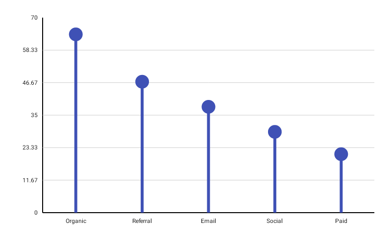
LollipopBarChart( data = { listOf( BarData(label = "Jan", value = 120f), BarData(label = "Feb", value = 85f), BarData(label = "Mar", value = 200f), BarData(label = "Apr", value = 60f), BarData(label = "May", value = 175f), ) }, modifier = Modifier.fillMaxWidth().height(300.dp), colors = ChartyColor.Solid(Color(0xFF2196F3)), config = LollipopBarChartConfig( stemThickness = 6f, circleRadius = 14f, animation = Animation.Default, ), onBarClick = { barData -> println("Clicked: ${barData.label} = ${barData.value}") },)Ring heads#
config = LollipopBarChartConfig( circleRadius = 16f, circleStrokeWidth = 3f, circleColor = ChartyColor.Solid(Color(0xFF1565C0)),)circleStrokeWidth > 0f draws the head as a ring instead of a filled disc. circleColor overrides the chart-level colors for the head only; leave it null to reuse colors.
Rolling window#
config = LollipopBarChartConfig(visibleWindow = 20, animation = Animation.Fast)Keeps only the last N lollipops on screen; null or at least 2.
Persistent markers#
config = LollipopBarChartConfig( visibleWindow = 20, markers = listOf(PersistentMarker(dataIndex = -1, label = "Now")),)A negative dataIndex counts back from the end of the drawn data, so -1 marks the newest entry.
Animating value changes#
config = LollipopBarChartConfig(animateValueChanges = true, animation = Animation.Fast)Tooltip#
LollipopBarChart( data = { series }, modifier = Modifier.fillMaxWidth().height(300.dp), colors = ChartyColor.Solid(Color(0xFF2196F3)), tooltip = ChartTooltip.canvas(), config = LollipopBarChartConfig( tooltipFormatter = { barData -> "${barData.label}: ${barData.value}" }, ),)Crosshair#
A vertical guide snaps to the centre of the nearest lollipop head — the same anchor its persistent markers use. The label reads config.tooltipFormatter, so it says exactly what a tap says.
Taps are untouched: the crosshair runs as its own gesture, so tapping still raises the tooltip and fires the click callback. Streaming scrollback does not survive a crosshair — the crosshair owns the drag.
Accessibility#
A generated summary plus one focusable node per entry.
interactionConfig = ChartInteractionConfig(accessibilityDescription = "Monthly signups")LollipopBarChartConfig#
| Property | Type | Default | Description |
|---|---|---|---|
barWidthFraction | Float | 0.2f | Slot fraction each lollipop occupies; 0f..1f |
stemThickness | Float | 6f | Stem width in pixels; must be positive |
circleRadius | Float | 14f | Head radius in pixels; must be positive |
circleStrokeWidth | Float | 0f | > 0f draws the head as a ring; non-negative |
circleColor | ChartyColor? | null | Head colour override; null reuses colors |
animation | Animation | Animation.Enabled() (800 ms) | Grow-from-baseline entry animation |
animateValueChanges | Boolean | false | Tween values on data change |
markers | List<PersistentMarker> | emptyList() | Persistent pinned labels |
tooltipConfig | TooltipConfig? | null (the theme's) | Canvas tooltip appearance |
tooltipPosition | TooltipPosition | AUTO | ABOVE, BELOW, or AUTO |
tooltipFormatter | (BarData) -> String | "label: value" | Tooltip text |
visibleWindow | Int? | null | Rolling "show last N" window; null or >= 2 |
Limitations#
- No corner radius, no reference line, and no data labels.
- There is no
negativeValuesDrawModeon this config.