MatrixHeatmapChart#
Best for a general-purpose grid of cells where colour intensity encodes magnitude — activity by weekday and hour, correlation matrices, cohort tables. Unlike CalendarHeatmapChart it is not tied to dates: rows and columns are whatever labels the data carries.
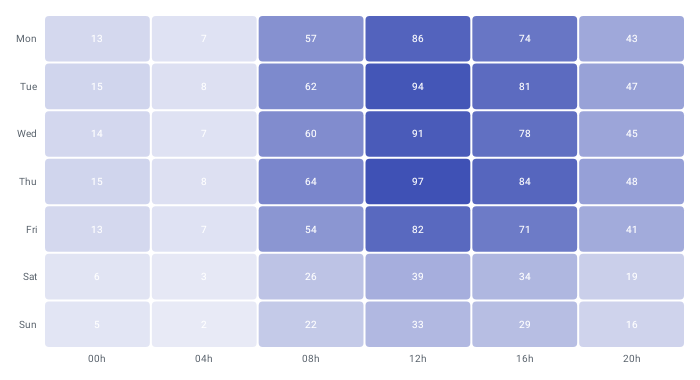
MatrixHeatmapChart( data = { listOf( HeatmapCell(rowLabel = "Mon", columnLabel = "9h", value = 12f), HeatmapCell(rowLabel = "Mon", columnLabel = "10h", value = 30f), HeatmapCell(rowLabel = "Tue", columnLabel = "9h", value = 22f), HeatmapCell(rowLabel = "Tue", columnLabel = "10h", value = 8f), ) }, modifier = Modifier.fillMaxWidth().height(240.dp), config = MatrixHeatmapConfig(showValues = true), onCellClick = { cell -> println("${cell.rowLabel} x ${cell.columnLabel}: ${cell.value}") },)Rows and columns are derived from the data: distinct rowLabel and columnLabel values in first-appearance order, so the order you emit cells in defines the axis order. Values are normalised across the whole dataset and mapped onto colorScale; grid positions with no matching cell are painted with emptyCellColor. Duplicate (rowLabel, columnLabel) pairs keep the last occurrence. An empty list renders the built-in empty state.
Row labels are drawn to the left of the grid and column labels below it. The chart draws on its own canvas and fills the size given by modifier — there is no axis scaffold.
Colour scale#
colorScale is a ChartyColor. A Gradient interpolates between its stops from the lowest to the highest value; a Solid paints every cell the same colour.
config = MatrixHeatmapConfig( colorScale = ChartyColor.Gradient(listOf(Color(0xFFFFF3E0), Color(0xFFE65100))), emptyCellColor = ChartyColor.Solid(Color(0xFFF5F5F5)),)Cell values#
config = MatrixHeatmapConfig( showValues = true, valueFormatter = { value -> "${value.toInt()}%" }, cellCornerRadius = 8f, cellSpacing = 4.dp,)Tooltip#
Tapping a cell that has data raises a tooltip and calls onCellClick — the two work together rather than replacing one another. Tapping an empty position dismisses the tooltip.
MatrixHeatmapChart( data = { cells }, modifier = Modifier.fillMaxWidth().height(240.dp), tooltip = ChartTooltip.canvas(), config = MatrixHeatmapConfig( tooltipFormatter = { cell -> "${cell.rowLabel} / ${cell.columnLabel}: ${cell.value}" }, ),)Use a Compose overlay instead of the canvas bubble when you need real layout:
MatrixHeatmapChart( data = { cells }, modifier = Modifier.fillMaxWidth().height(240.dp), tooltip = ChartTooltip.compose { Text(text = "${data.rowLabel}: ${data.value}") },)ChartTooltip.none() disables it entirely, leaving onCellClick as the only interaction.
Accessibility#
An auto-generated screen-reader summary describes the grid. Override it with accessibilityDescription, or pass an empty string to suppress it.
MatrixHeatmapChart( data = { cells }, modifier = Modifier.fillMaxWidth().height(240.dp), accessibilityDescription = "Support volume by weekday and hour",)MatrixHeatmapConfig#
| Property | Type | Default | Description |
|---|---|---|---|
colorScale | ChartyColor | Gradient(#E3F2FD → #0D47A1) | Scale that low-to-high values map onto |
emptyCellColor | ChartyColor | Solid(#EBEDF0) | Fill for grid positions with no data |
cellSpacing | Dp | 2.dp | Gap between adjacent cells |
cellCornerRadius | Float | 4f | Corner rounding of each cell, in pixels |
showValues | Boolean | false | Draws the formatted value inside each cell |
valueFormatter | (Float) -> String | built-in numeric format | Formats in-cell values |
labelTextStyle | TextStyle | 10 sp, #57606A | Style for row/column labels and in-cell values |
tooltipFormatter | (HeatmapCell) -> String | built-in | Text of the tap tooltip |
tooltipConfig | TooltipConfig? | null (the theme's) | Appearance of the canvas tooltip |
animation | Animation | Animation.Default | Diagonal fade-and-scale entry animation |
HeatmapCell(rowLabel: String, columnLabel: String, value: Float).
Limitations#
- Not a Cartesian chart: no
visibleWindow, nomarkers, noanimateValueChanges, no crosshair, no viewport pan/zoom. - There is no legend for the colour scale; render one yourself if the mapping needs explaining.