WaterfallChart#
Best for showing cumulative effects of sequential positive and negative values — profit/loss bridges, cash flow, budget variance.
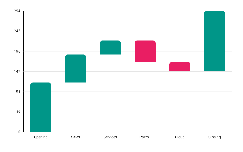
WaterfallChart( data = { listOf( BarData(label = "Start", value = 500f), BarData(label = "Revenue", value = 200f), BarData(label = "Costs", value = -150f), BarData(label = "Tax", value = -50f), ) }, modifier = Modifier.fillMaxWidth().height(300.dp), config = WaterfallChartConfig( positiveColor = ChartyColor.Solid(Color(0xFF43A047)), negativeColor = ChartyColor.Solid(Color(0xFFD64C66)), cornerRadius = CornerRadius.Medium, animation = Animation.Default, ), onBarClick = { barData -> println("${barData.label}: ${barData.value}") },)Every bar is a delta. The chart runs a single accumulator from 0f through the list, and each bar floats between the running total before and after its own value. There is no special handling for the first or last entry — if you want a closing "Total" bar you have to model it as a delta yourself, or leave it out. (A final BarData(label = "End", value = 500f) would add another 500, not restate the total.)
Colours come from the config, not from a chart-level parameter: positiveColor for gains, negativeColor for losses. WaterfallChart has no color/colors parameter.
Corner radius#
config = WaterfallChartConfig(cornerRadius = CornerRadius.Custom(radius = 6f))None, Small, Medium, Large, ExtraLarge, or Custom(radius).
Rolling window#
config = WaterfallChartConfig(visibleWindow = 12, animation = Animation.Fast)Keeps only the last N steps on screen; null or at least 2.
Persistent markers#
Markers anchor to the top edge of each floating bar, so they sit above the bar for gains and losses alike.
config = WaterfallChartConfig( visibleWindow = 12, markers = listOf(PersistentMarker(dataIndex = -1, label = "Running total")),)A negative dataIndex counts back from the end of the drawn data, so -1 marks the newest step.
Animating value changes#
config = WaterfallChartConfig(animateValueChanges = true, animation = Animation.Fast)Tooltip#
WaterfallChart( data = { steps }, modifier = Modifier.fillMaxWidth().height(300.dp), tooltip = ChartTooltip.canvas(), config = WaterfallChartConfig( tooltipFormatter = { barData -> "${barData.label}: ${barData.value}" }, ),)Crosshair#
A vertical guide snaps to the top edge of the nearest floating bar. The label reads the step's delta, not the running total, matching tooltipFormatter, the tap tooltip, and the BarData handed to onBarClick; use a marker to label a running total.
Taps are untouched: the crosshair runs as its own gesture, so tapping still raises the tooltip and fires the click callback. Streaming scrollback does not survive a crosshair — the crosshair owns the drag.
Accessibility#
A generated summary plus one focusable node per step.
interactionConfig = ChartInteractionConfig(accessibilityDescription = "Profit bridge from opening to closing balance")WaterfallChartConfig#
| Property | Type | Default | Description |
|---|---|---|---|
barWidthFraction | Float | 0.6f | Bar width as a fraction of its slot; 0f..1f |
cornerRadius | CornerRadius | CornerRadius.Medium | Bar corner rounding |
positiveColor | ChartyColor | Solid(Color.Yellow) | Fill for positive deltas |
negativeColor | ChartyColor | Solid(#D64C66) | Fill for negative deltas |
animation | Animation | Animation.Default | Entry animation |
animateValueChanges | Boolean | false | Tween values on data change |
markers | List<PersistentMarker> | emptyList() | Persistent pinned labels |
tooltipConfig | TooltipConfig? | null (the theme's) | Canvas tooltip appearance |
tooltipPosition | TooltipPosition | AUTO | ABOVE, BELOW, or AUTO |
tooltipFormatter | (BarData) -> String | "label: value" | Tooltip text |
visibleWindow | Int? | null | Rolling "show last N" window; null or >= 2 |
Note the default positiveColor is Color.Yellow; set it explicitly for anything user-facing.
Limitations#
- No reference line, and no data labels.
scaffoldConfigstyles the axes, grid, and label text style, but it has no value formatter — currency formatting has to happen in thelabelof eachBarData.